Clever Jane | A Punk Romance
While operating as Swag Design Factory & Swag Print Factory, Liz Parsons and her team had worked to develop beautiful, personality-driven brands for more than 15 years. As the business evolved and a longstanding creative partnership solidified, the time felt right to branch out on her own, separate from the print side of the business. It was time for a new name and identity; one that captured the spirit of her new business venture.
The Problem
The new identity needed to carry the reputation of their past into a new name and larger offerings. The design needed to be focused, driven by values, and carry a bit of a romantic edge.
Credits
Agency
Clever Jane & Majorette
My Role
Lead Designer Brand
Custom Logotype
The Team
Design & Development: Liz Parsons, Emily Kiana, Barry Begus
Naming & Messaging: Marget Milne, Elizabeth Hewitt
Photography: Josilyn Kilborn
Monogram
Graphic Pattern Element

The Concept
A Punk Romance
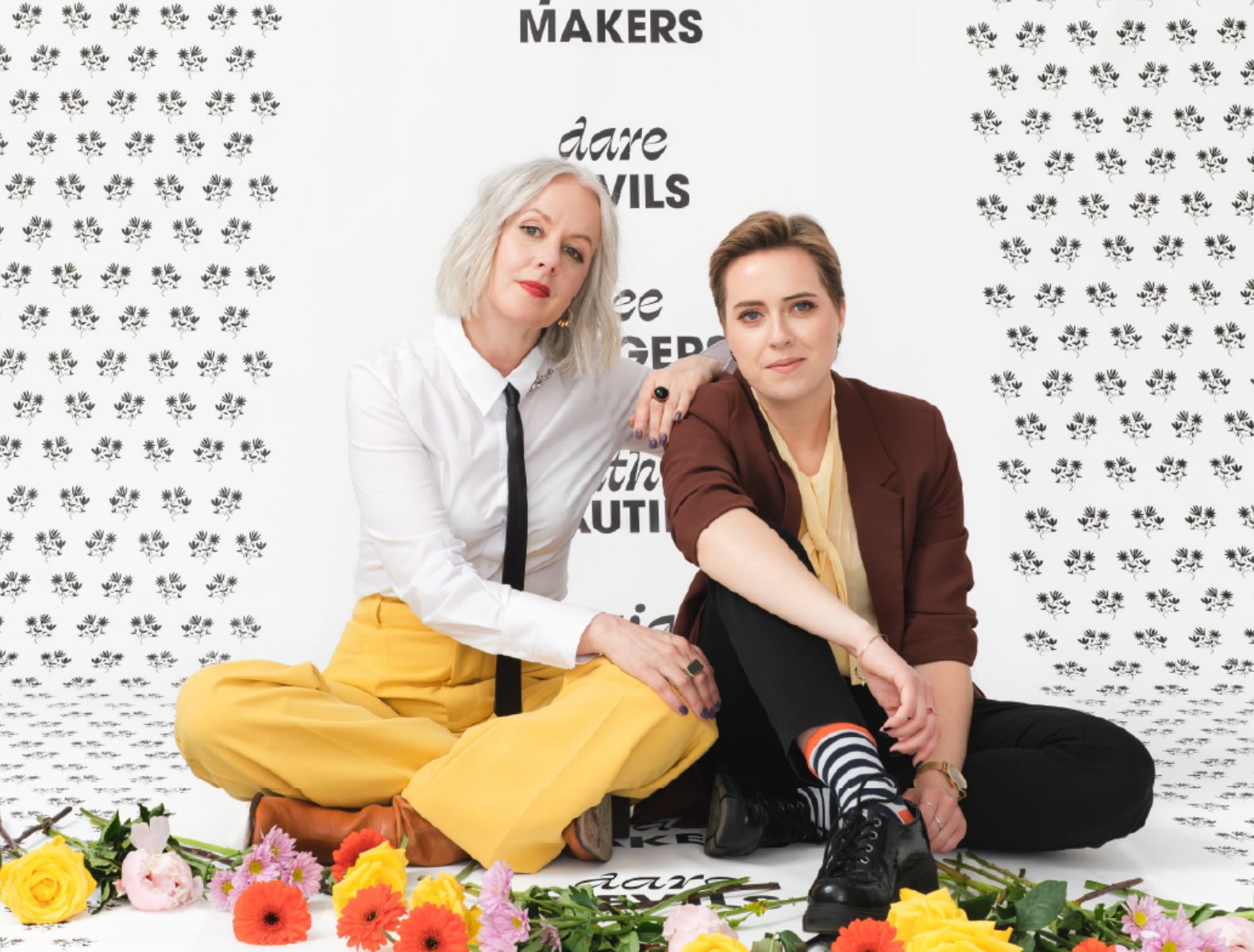
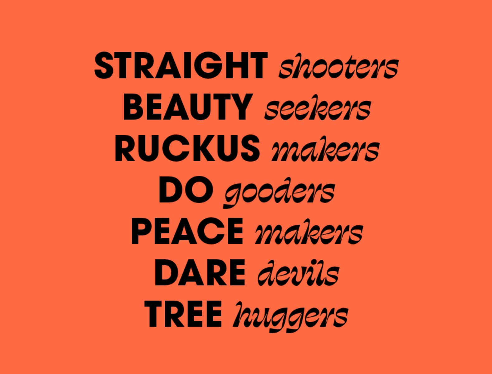
Liz (Owner and Art Director) had both a love for Jane Austen romance and things with a bit of edge. The team was a group of do-gooders and beauty seekers, but also straight shooters and ruckus makers. The identity needed to showcase both of those things. Clever Jane isn't your typical corporate branding agency; they let their values lead the way.

The Solution
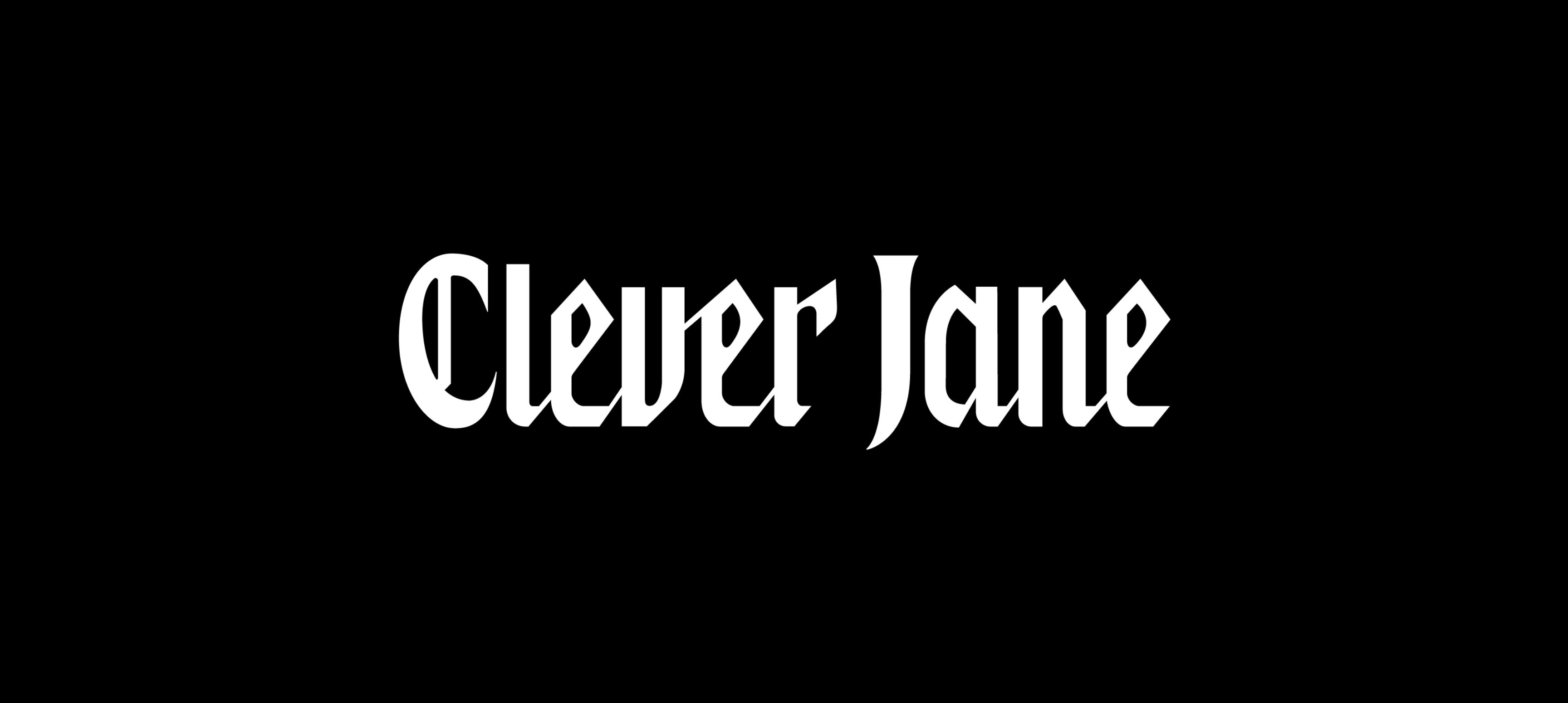
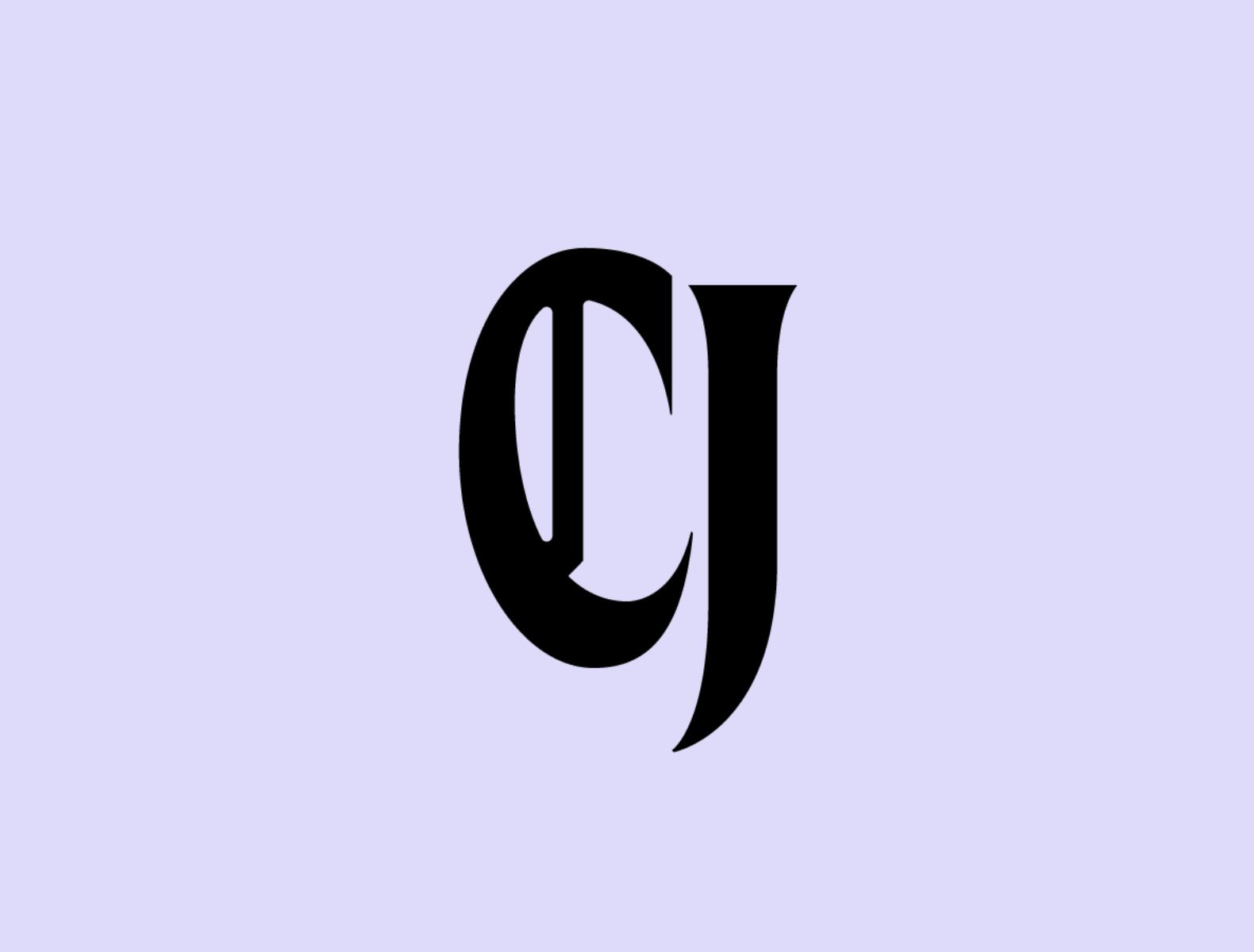
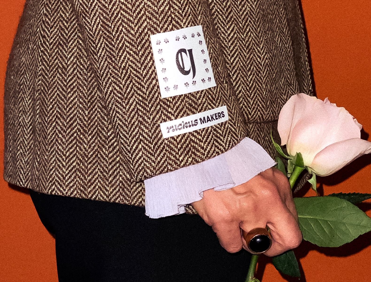
Swag Design Factory had long used vintage woodcuts and classic symbolism to represent its identity. We felt that traditional aspect wasn’t something we wanted to depart from altogether. This led to: Blackletter! A font category that’s both edgy and traditional, which is exactly the clash we wanted for Clever Jane. Depending on how you look at it, it’s either very traditional or leans a little punk. We thought it was the perfect fit. Starting with VJ Type’s Dahlia for the C and the J, I designed a custom wordmark for Clever Jane in the blackletter style. Fashion brands like Gucci and Vivienne Westwood heavily influenced this project.