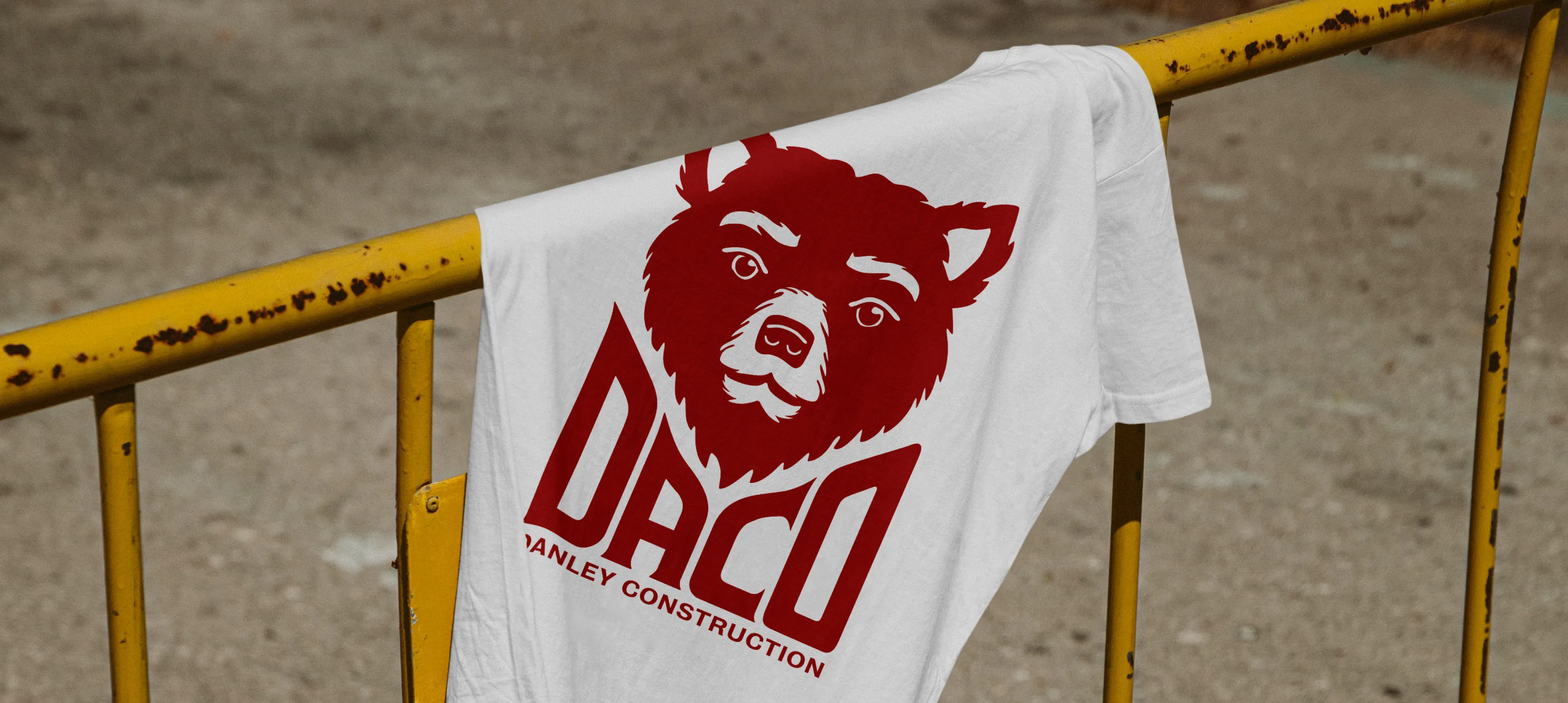
Danley Construction | Identity with Structure
Danley Construction is a family-owned construction company based on Vancouver Island, Canada, that was founded in 2006. They work on commercial/light industrial and residential projects. After 14 years of business, they felt it was time for a rebrand. Along with a new logo, they were looking to incorporate an abbreviation of their name.
The Problem
Danley Construction needed a design system that looked confident, professional, and reliable. The logo needed to convey the idea of construction a little bit better through geometry and structure. Their logo system needed to be flexible and applied to their website, documents, merch, and signage. As it stood, they didn't feel like their logo represented them well for where they wanted to go as a company.
Credits
Agency
Emily Kiana Design
My Role
Brand Design
Custom Typography
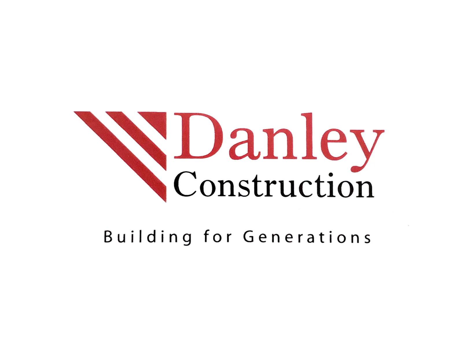
Before
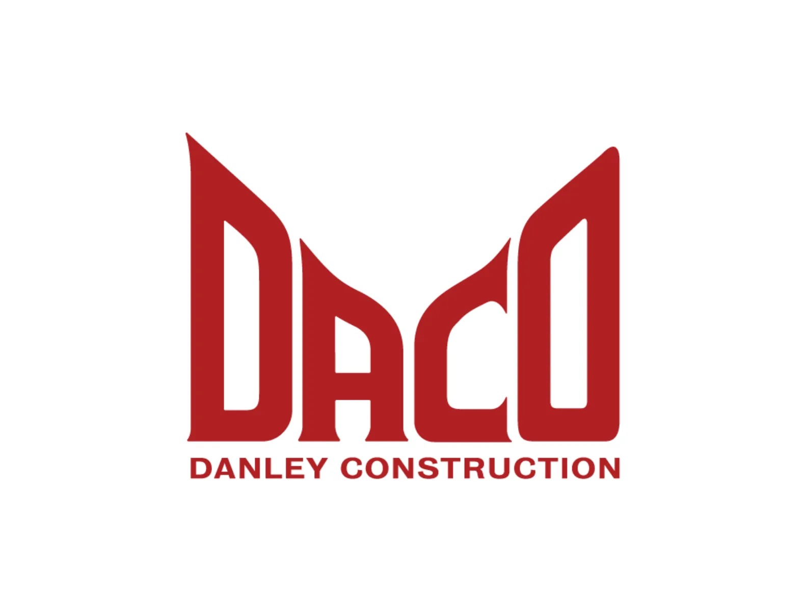
After

The Concept
Identity With Structure
Custom builds need custom design. How could we show structure without the use of construction clichés like boxes, houses, hammers, etc.? The answer: A custom logotype with strong linear lines emulating building frames. The inverted "roof" perfectly creates space for a diamond to communicate quality craftsmanship.

The Solution
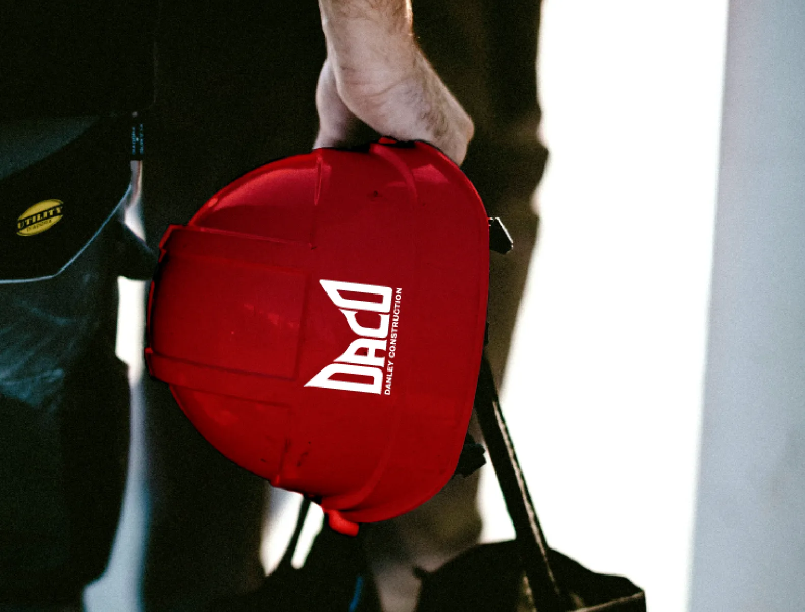
I designed a custom logotype that keeps some of the original logo's 45-degree angles and structural feel. The logotype led us to an abbreviation for Danley Construction that is now used by customers and staff. It creates a perfect diamond shape along the top to nest various merch designs that have been printed on T-shirts, sweatshirts, and hats.