Hubert Financial | Happy Savings
Hubert Financial is an online financial institution built to grow your savings. They provide an online space for Canadians to open savings and investment accounts at competitive rates.
The Problem
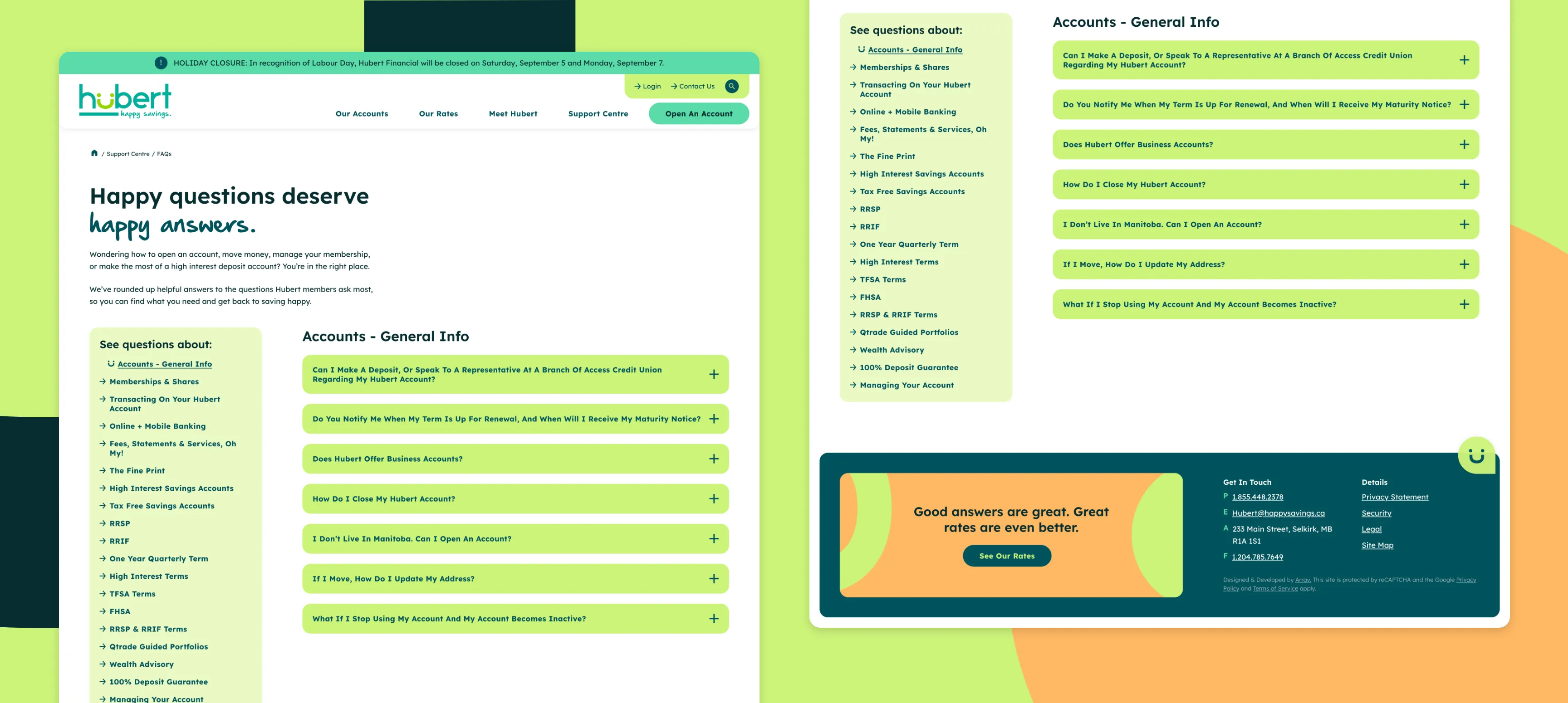
Hubert Financial had a defined logo and clear tagline: Happy Savings. They were facing a few problems: they wanted to appeal to a younger, mid-30s female audience; their colour palette and site design needed to evolve for accessibility; and they needed their site to be built to convert. They needed clearer and more accessible user journeys across their website.
Credits
Agency
Array
My Role
Lead Designer
Art Direction
Brand Expansion
The Team
Kristina Crowson, Sarah Brown, Myra Dionne, Bryan Keddy, Kim Weber, Bryan Caldeira, Alejandra Silva Rojas
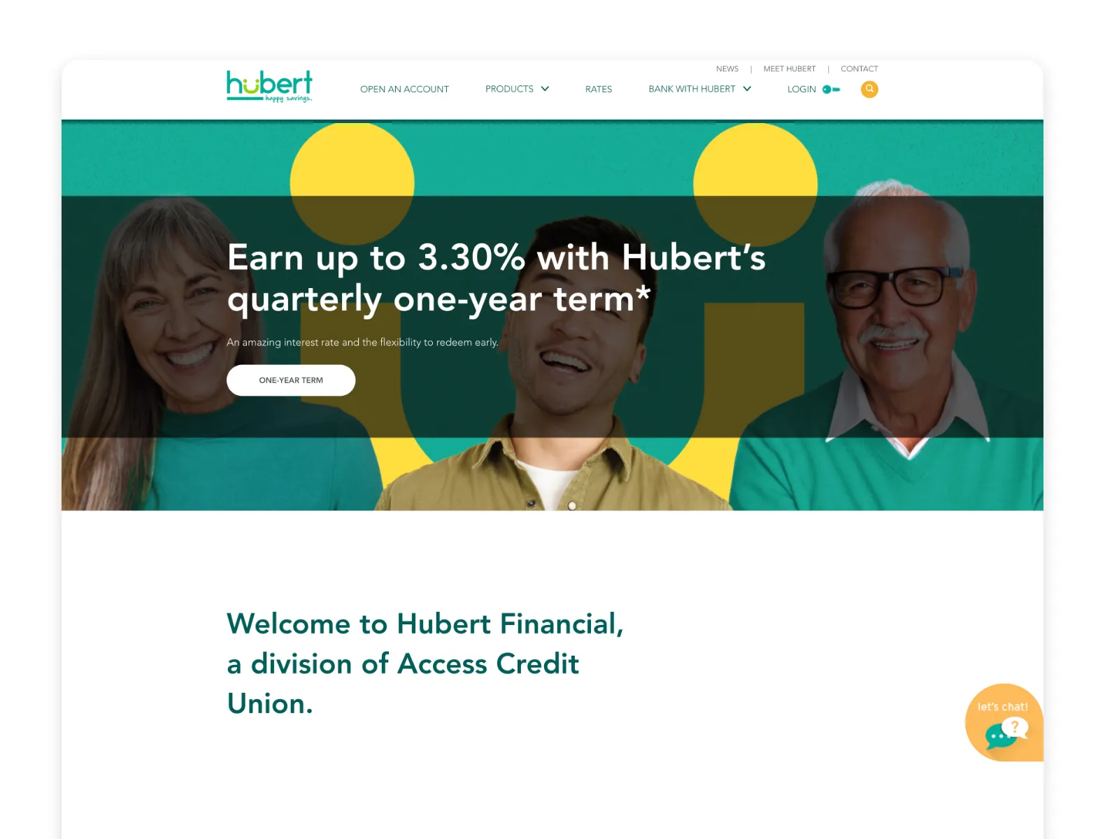
Before
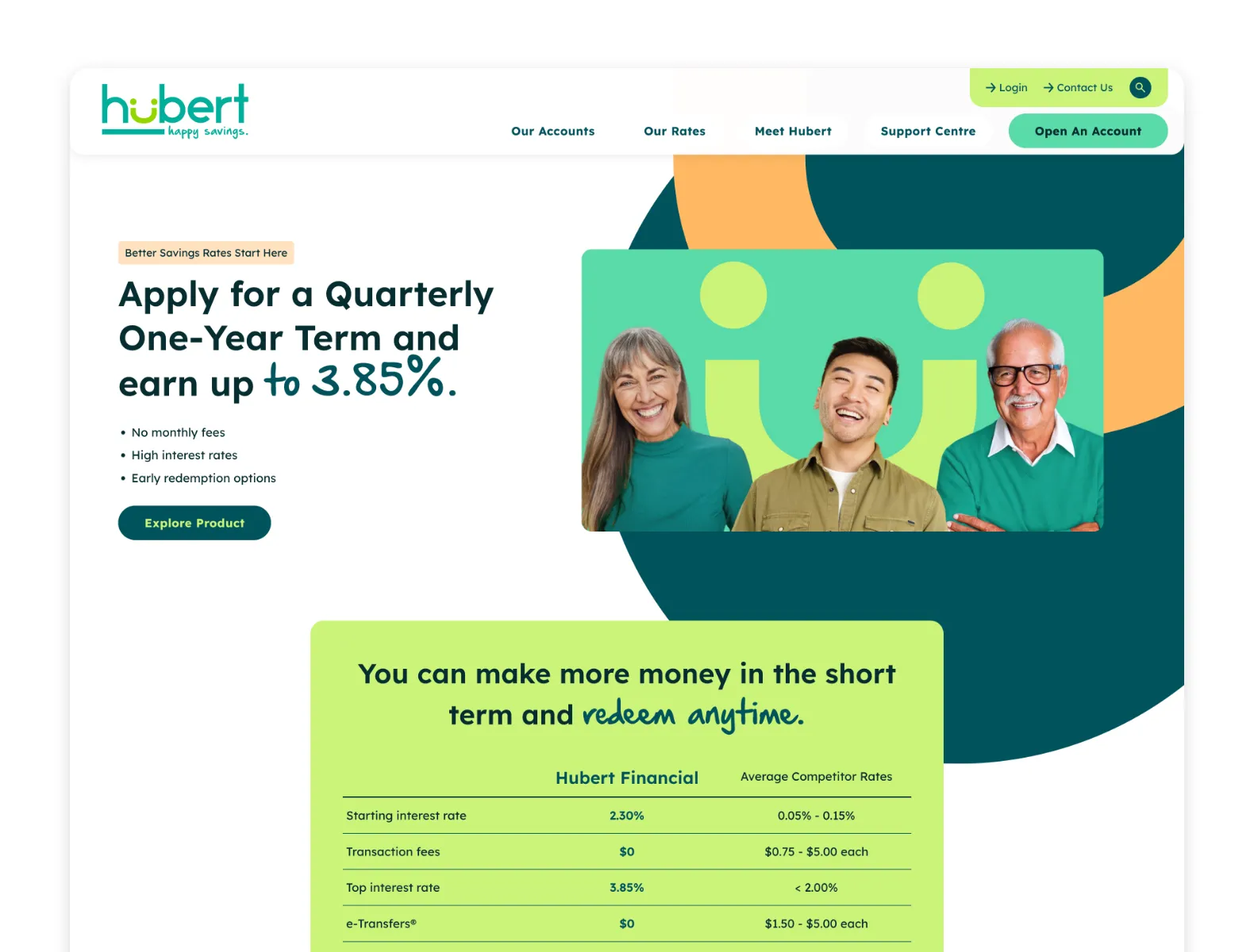
After

The Concept
Happy Savings
Hubert Financial had the bones of a great brand system, but it wasn't being used to its full potential. What does "happy savings" actually look like? What does life look like with financial stability and savings you can count on? It leaves more time for family and friends, vacations you've dreamt of, and confidence in your retirement.

The Solution
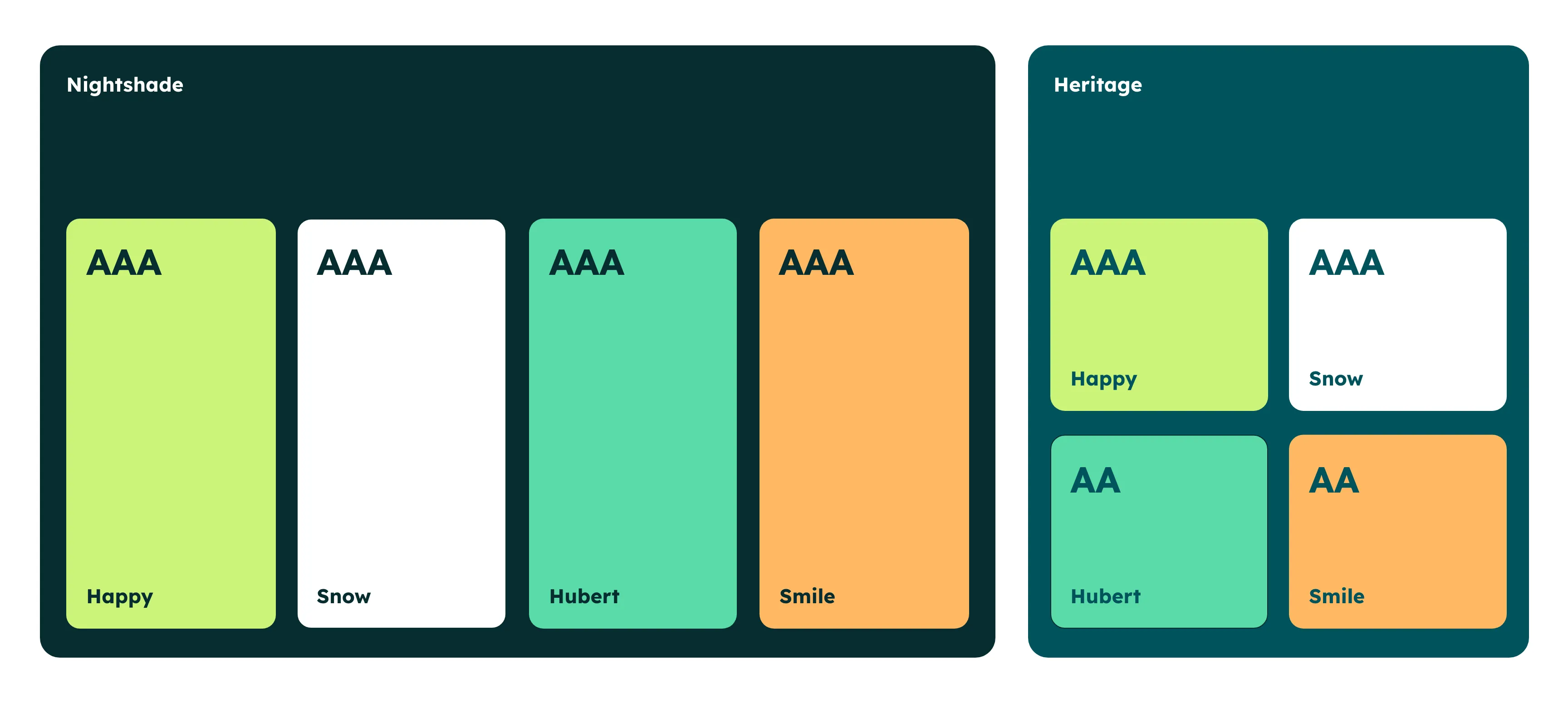
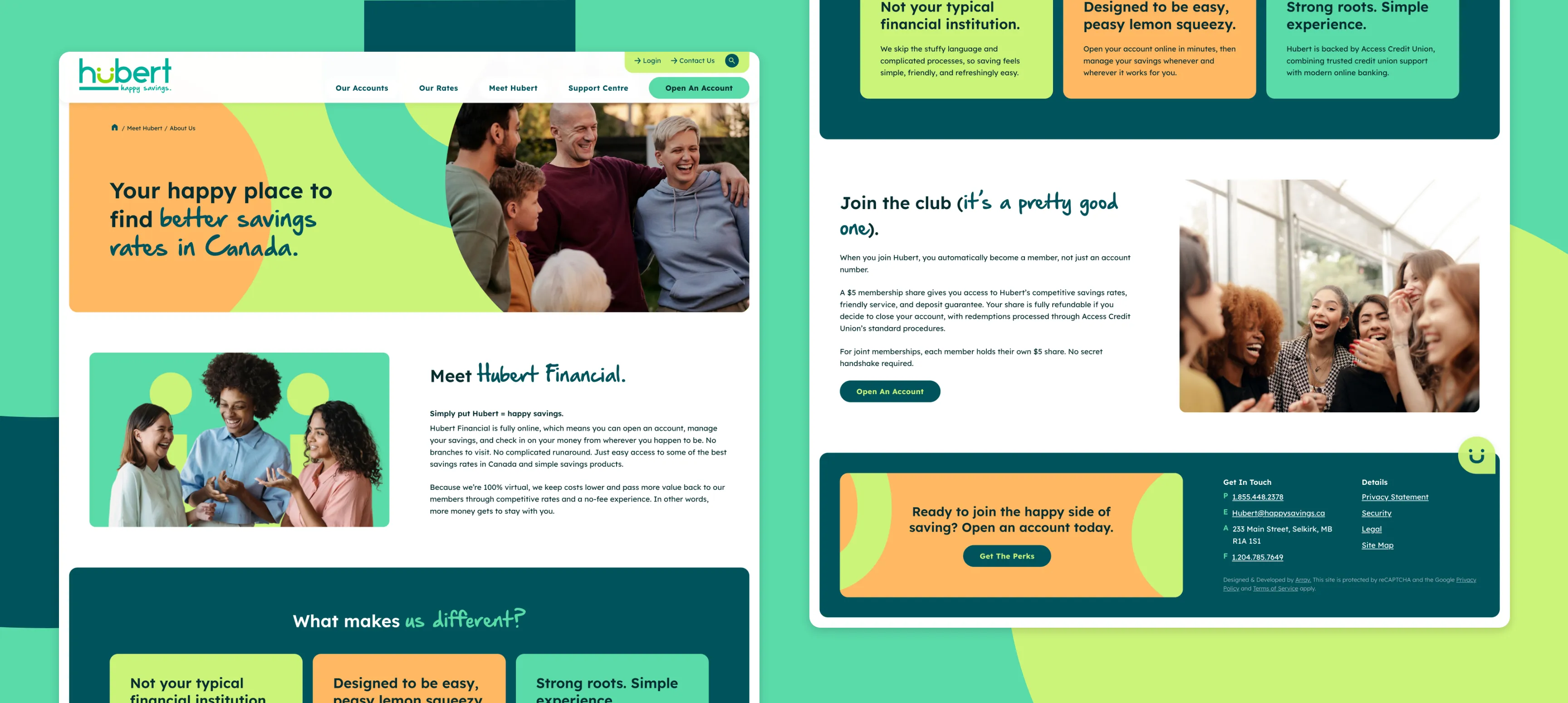
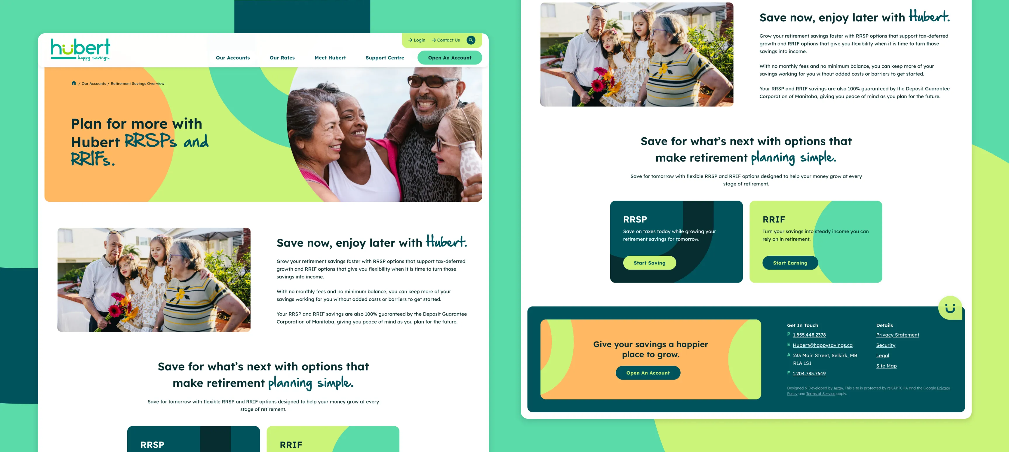
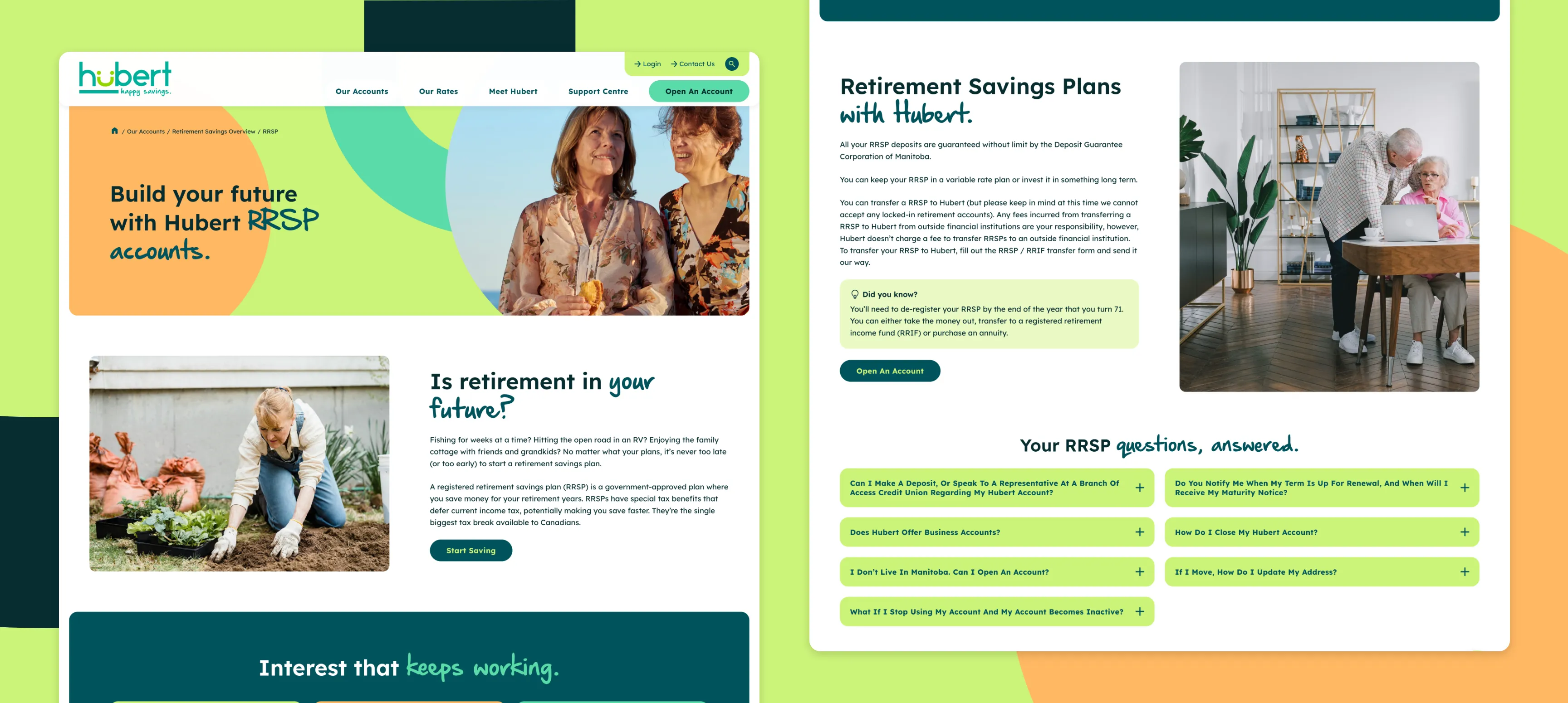
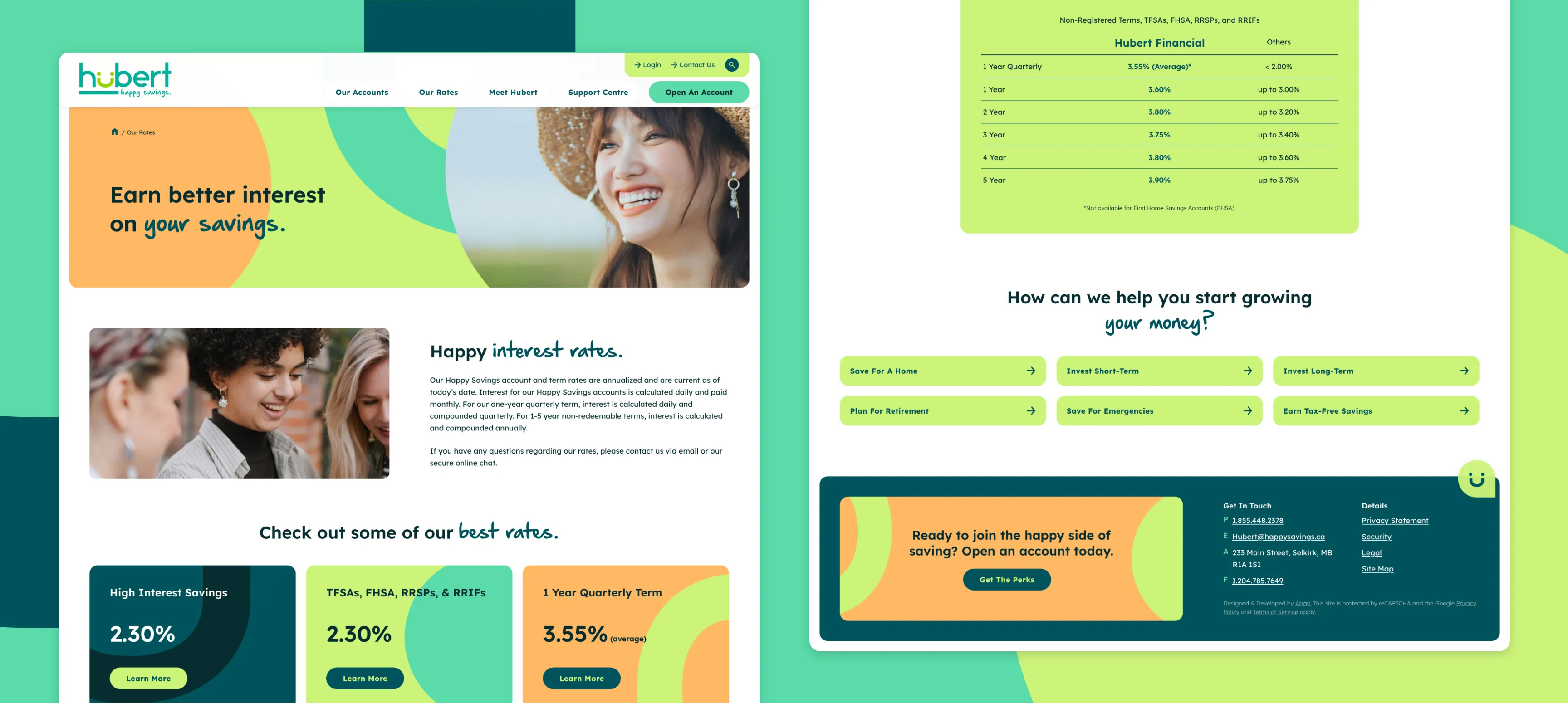
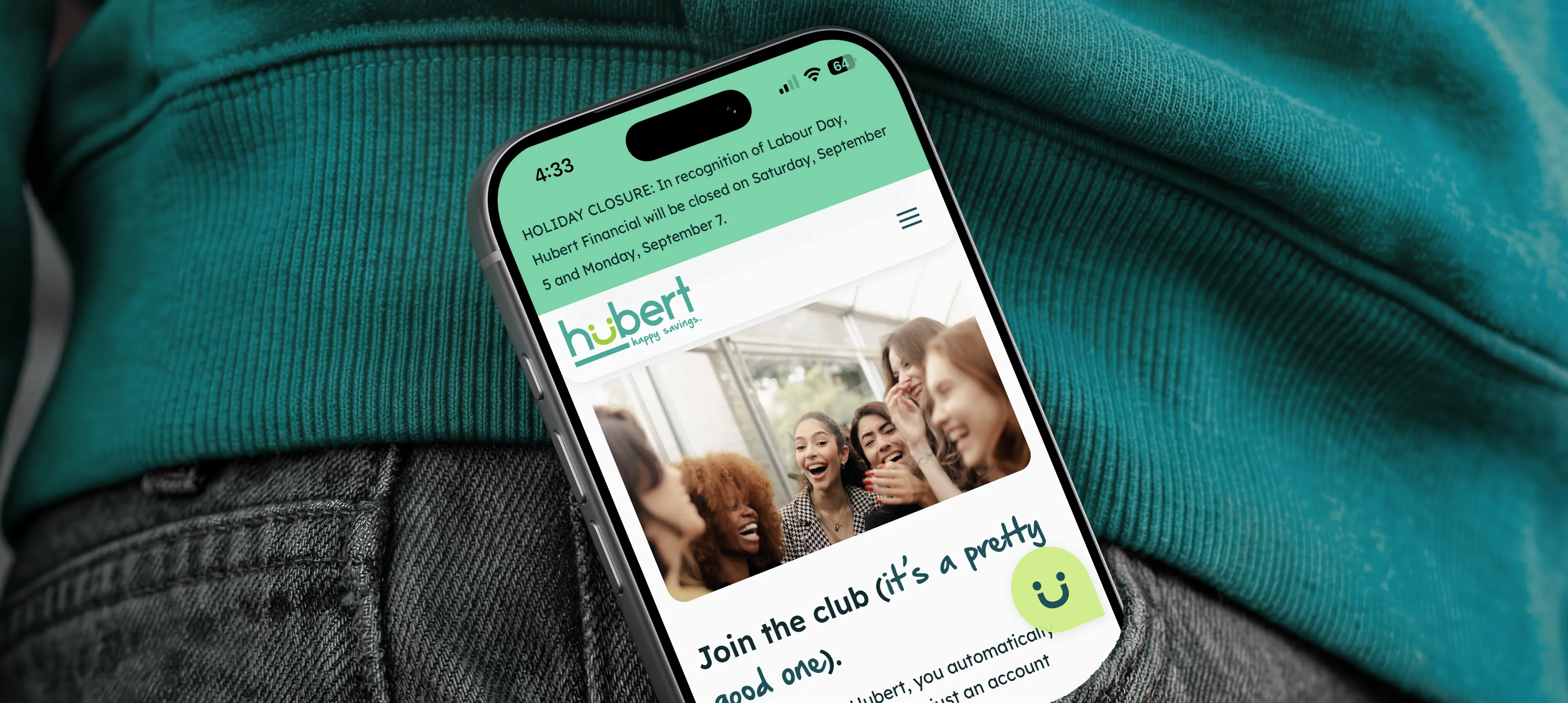
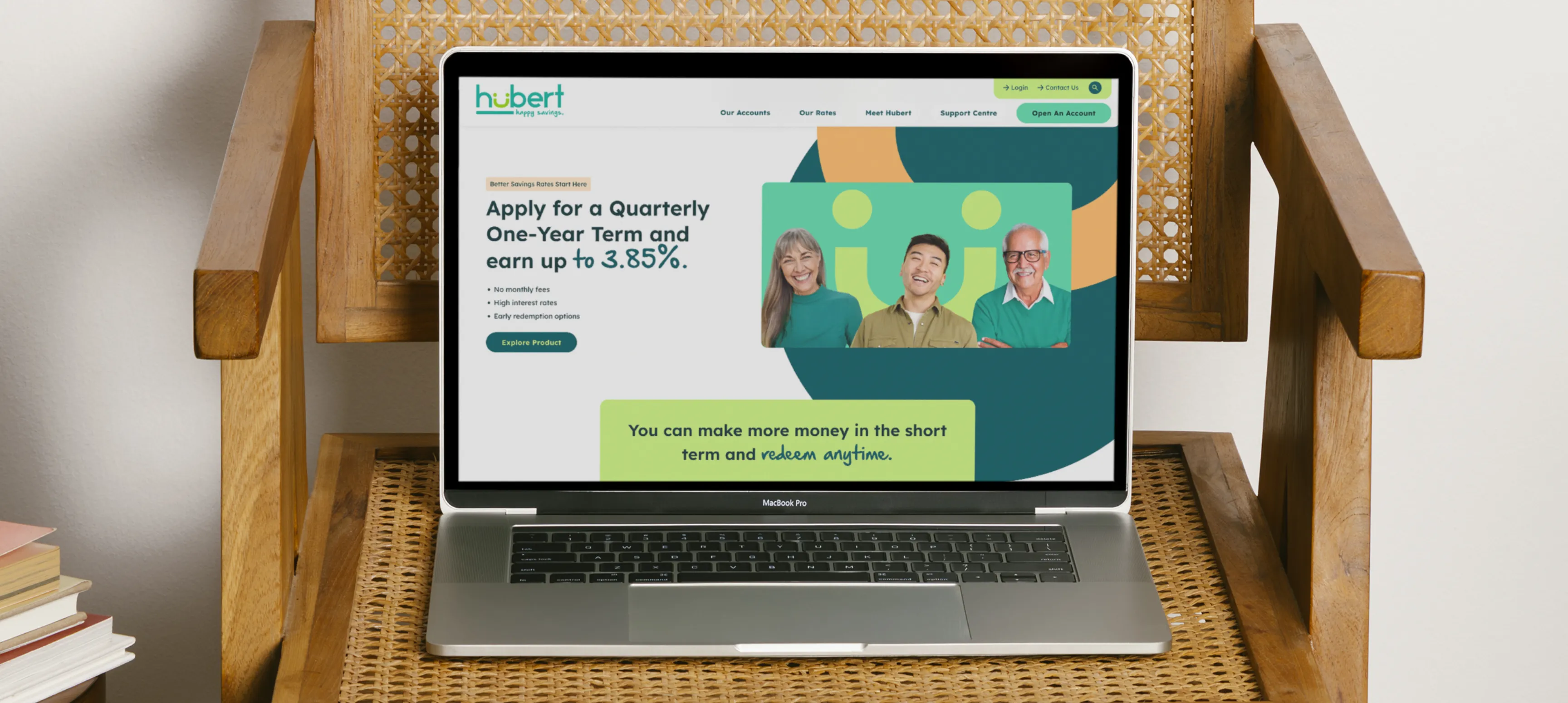
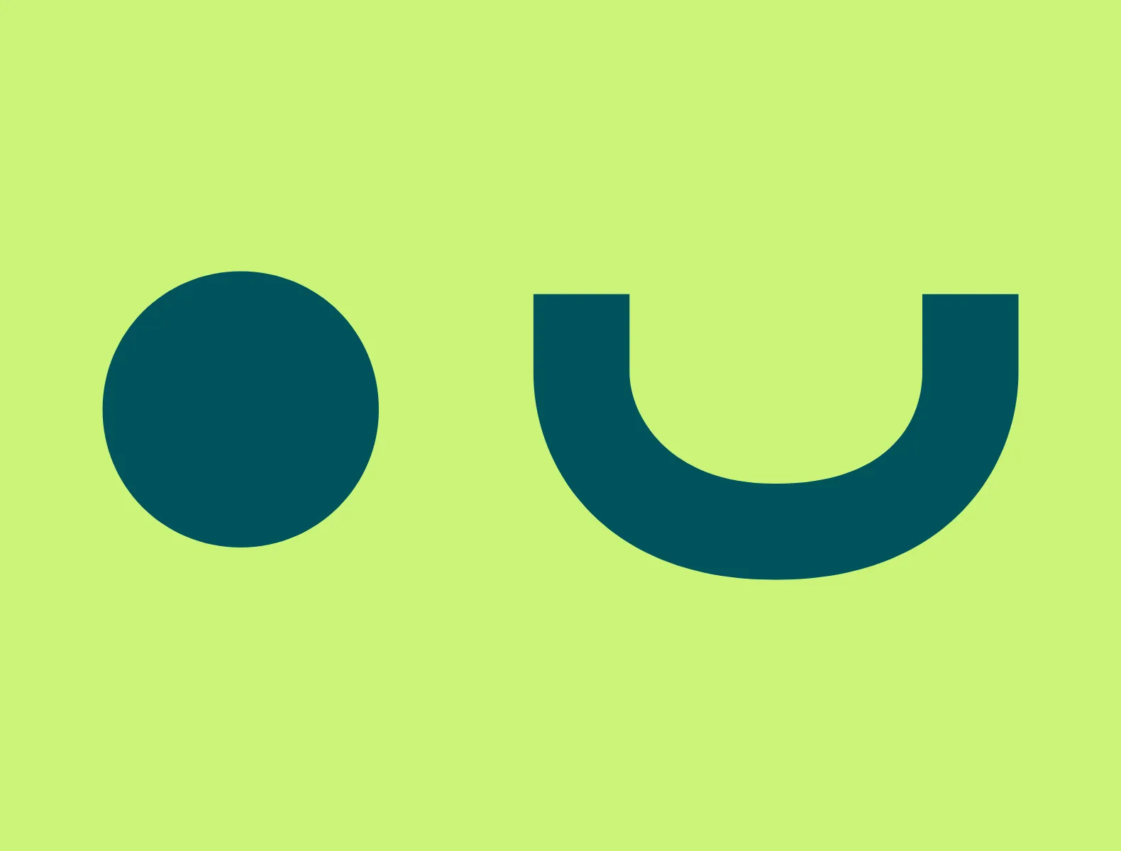
The process started with taking their existing colour palette and tweaking and expanding on it to make strong, accessible colour pairings. The palette is friendly, punchy, and warm. From there, we took the logo icon and deconstructed it into its two main pieces: the smile and the eyes. This allowed for geometric shapes that could be layered and animated to create depth and friendliness throughout the design. Micro-interactions in button hovers showcased the smile and Hubert winking. Photography was strategically sourced to show life with "happy savings." People on vacation, families together, and living life to the fullest.