Magpies Nanaimo
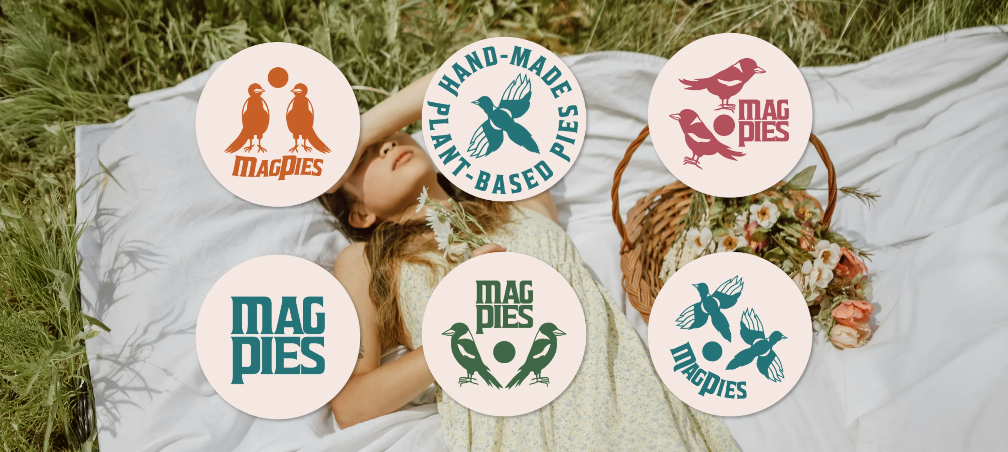
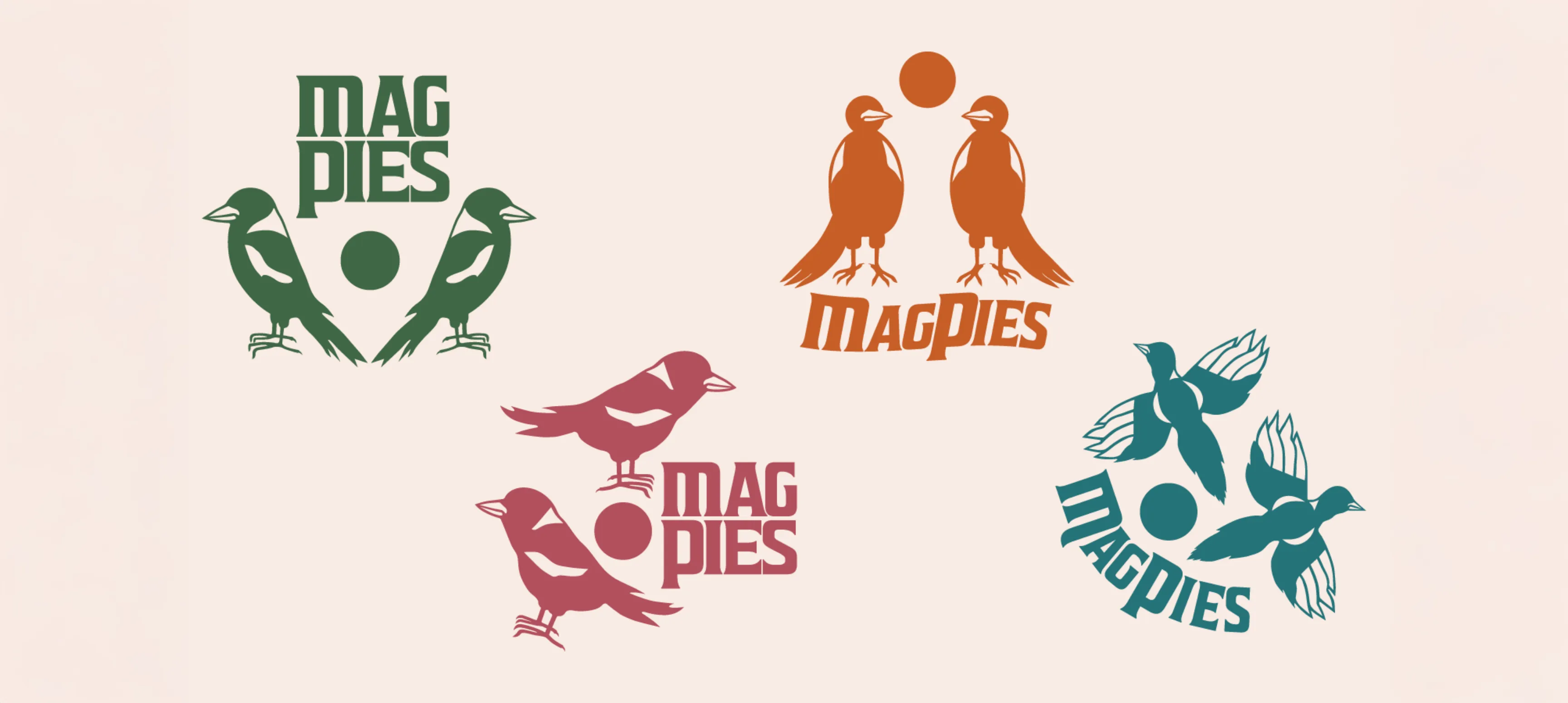
MagPies was making plant-based seasonal pies using locally sourced ingredients. When Cathy contacted me I was very excited to start this project. Vegan pies? Sign me up! We decided to design a brand system with logo variations for each season. The primary application for these logos would be on MagPies’ pie labels, so it made sense to have a transitional system that would be used as visual cues for each new season.
The Problem
MagPies wanted a facelift to create a more “hip” brand system that appealed to the 20-30 crowd. The Magpie needed to stay a part of the brand, but in a way that it could illustrate transitioning through seasons. MagPies offers seasonal pie subscriptions that are often in line with cyclical farming practices, as they source local ingredients from local farmers. We needed to represent pie, seasons, and growth/change.
Credits
Agency
Emily Kiana Design
My Role
Brand Identity Design
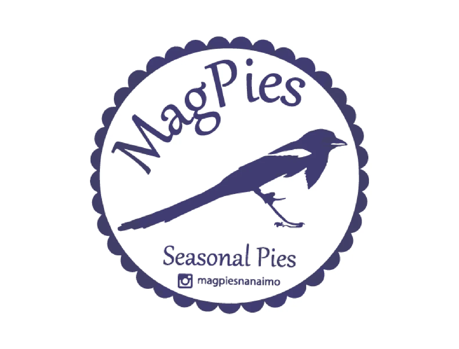
Before

After
The Concept
Changing Seasons
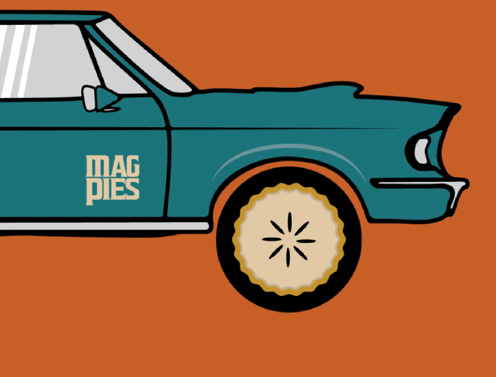
During discovery and research, I found out that Cathy loves rock album covers and posters. She also related MagPies to Mary Poppins. It was clear that we should take the often traditional branding that bakeries have and give it a bit of an edgy twist. We did that by using clean, hard lines and some font inspiration from The Beatles, The Rolling Stones, and ACDC while adding a sprinkle of whimsy.
The Solution
We took the idea of the magpie bird and expanded on it for the rebrand, showing it in different forms and stages. The circle represents the moon but also hints at the circular shape of the pie. The colours are natural and seasonal, representing fresh flavours and earth tones.
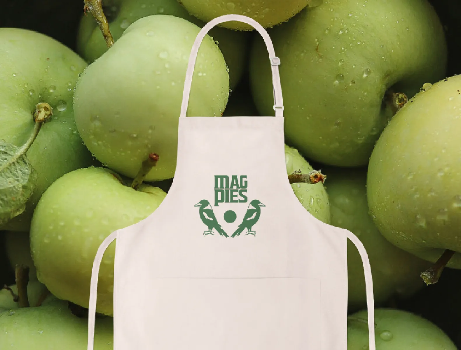
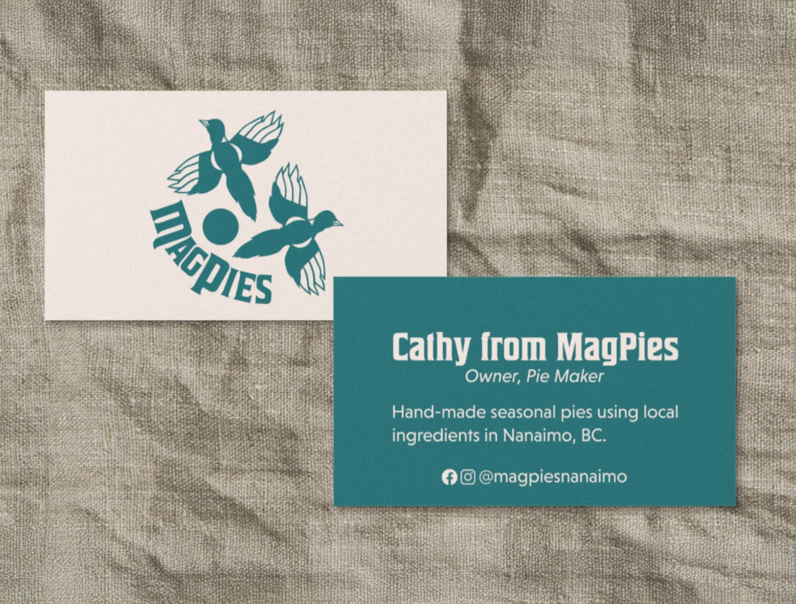
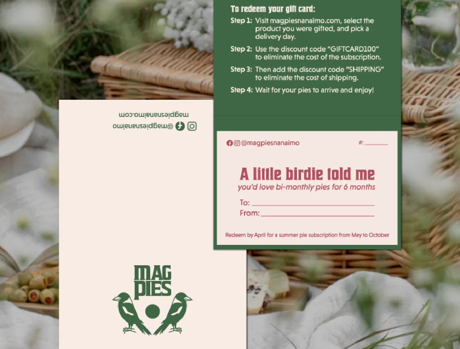
After the brand identity system was designed, it needed to be applied to stationery such as gift cards, labels, and Cathy’s website. The goal was to create a simplified system for her labels that could be used for multiple flavours throughout the seasons.