Nanaimo-Ladysmith Schools Foundation | Grow Together
Nanaimo-Ladysmith Schools Foundation is a community-powered foundation working side-by-side with schools, donors, and volunteers across Nanaimo and Ladysmith. They provide aid for students so they thrive both in the classroom and in life through the following initiatives: Student Support Fund, Food4Schools, Scholarships & Bursaries, and Learning Initiatives & Grants.
The Problem
There were a few overarching goals for Nanaimo-Ladysmith Schools Foundation. First, NLSF had a brand and subbrands, but they didn’t feel connected. People needed to know that all of their community initiatives (with varying levels of recognizability within the community) were connected to NLSF. They needed one cohesive brand identity system that felt like it all came from one family. Secondly, they needed to be perceived as trustworthy, established, and professional. Donors needed to know who they were donating to and why. This came through a cohesive brand system, but also a strong brand messaging strategy (written by Myra Dionne at Array).
Credits
Agency
Array
My Role
Lead Designer Brand & Web
Art Direction
The Team
Kristina Crowson, Sarah Brown, Jason Schultz, Myra Dionne, Bryan Keddy, Kim Weber, Bryan Caldeira, Alejandra Silva Rojas, Aaron Paetkeau

Before
After

The Concept
Grow Together.
NLSF supports student growth by providing the tools students need to succeed. What does it look like when those needs are met? Kids who are supported, well-fed, and have all of the supplies needed to do their best learning. Our focus wasn't on whatever "before" NLSF may look like, but rather what support with NLSF looks like. We showed growth, nourishment, and education through a brand system that could be dynamic for each offering. The logo, fonts, colours, messaging, photography, and patterns all needed to work together to tell their brand story.


The Solution
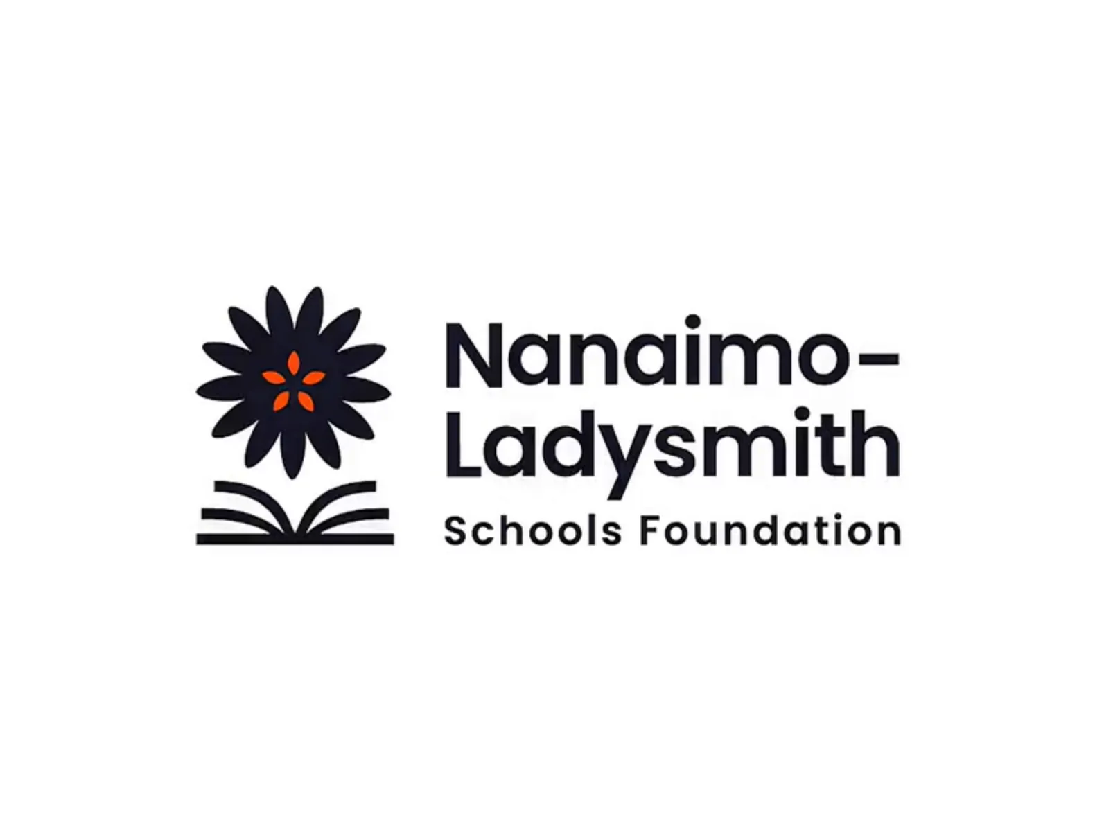
Not every rebrand is a complete departure from where a brand started. The original Nanaimo-Ladysmith Schools Foundation logo had four parts: a book, a tree, a person, and a moon. Taking inspiration from the roots of where they've come from, this new logo combines a book, a flower, and the core of an apple. It represents the growth that comes through education, and the support that NLSF offers students, families and educators to help them flourish. The flower has 13 petals to represent each year of education from K-12. The apple core seeds form a star to help represent the seeds that are planted to help kids thrive financially, in resources, and in nourishment. By isolating each separate element from within the logo, different graphic elements and patterns were created. Each piece adds depth and meaning to layouts to hold the symbolism for what NLSF stands for.