Queens Liquor
Queens Liquor is making high-quality, handcrafted spirits that add a little class to your glass. It’s time to start making cocktails that are fit for a queen… or two.
The Problem
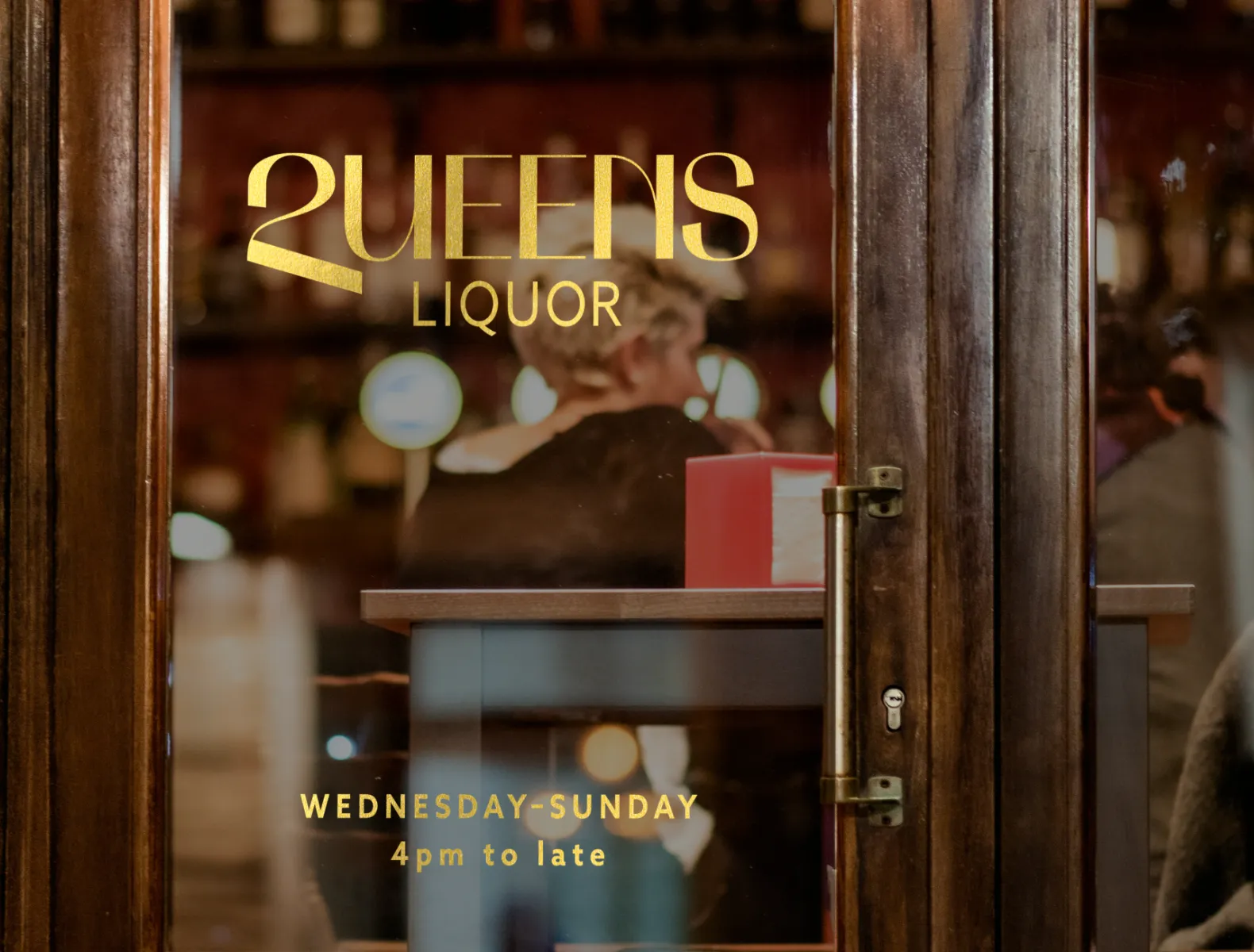
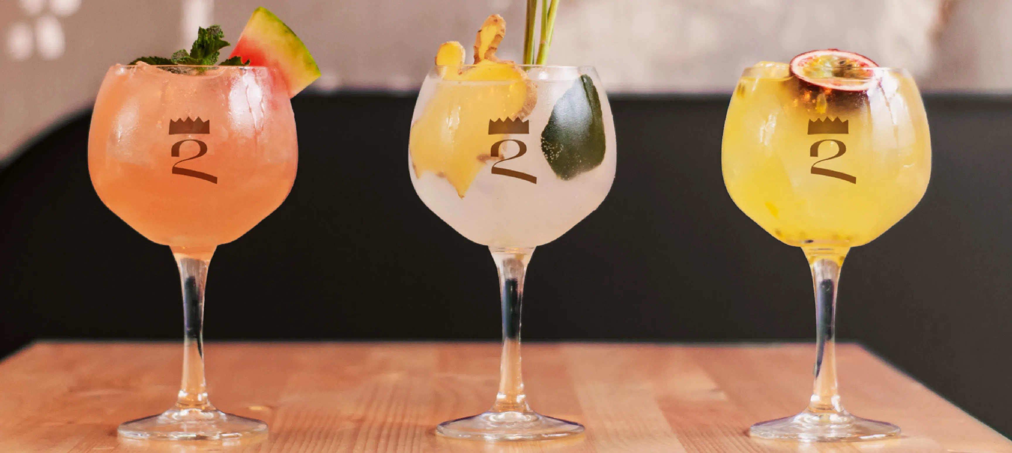
The goal for this project was to design a brand that was high-end, luxury, and hand-crafted. It should feel warm but also celebratory. A bottle that you’d reach for on a special occasion. The packaging should display well, stand out against competitors, and be flexible with ever-changing flavours.
Credits
Agency
Emily Kiana Design
*This is a hypothetical personal project.
My Role
Brand Identity Design
Art Direction
Illustration
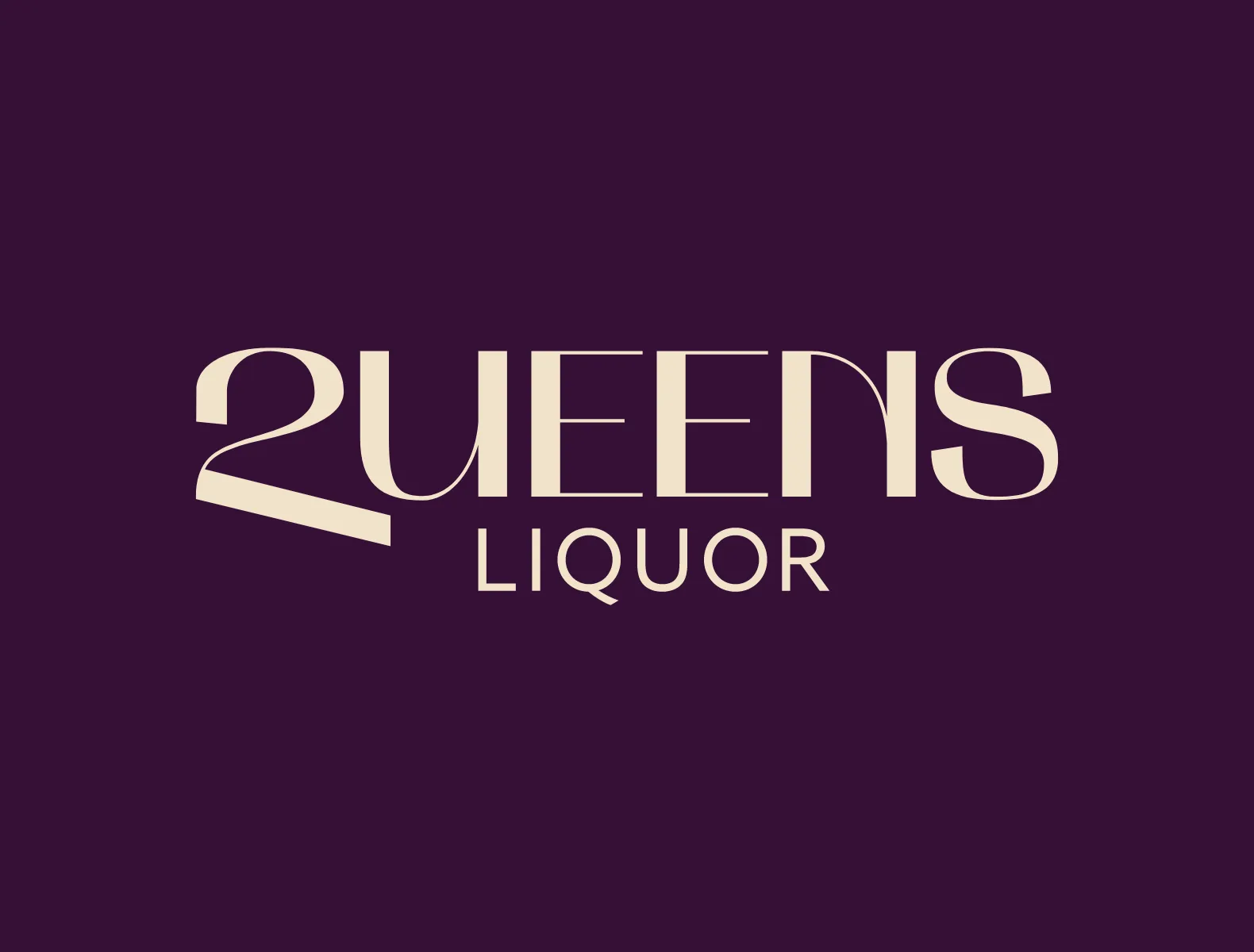
Wordmark

Label Illustration


The Solution
The illustration came first, a reflection of a queen. Seeing the 2 queens face each other I immediately thought about the cursive Q. To me, it has often looked like a 2 when written out. The symbolism of this made a lot of sense for this brand. Typing out the 2 wasn’t enough, it was too narrow in comparison to the rest of the letters, so I customized it to fit the wordmark better. I gave the bottom crossbar an angle to echo the angle of the tail of a Q. The final solution is a unique and scalable wordmark accompanied by a Q monogram crowned like a queen.