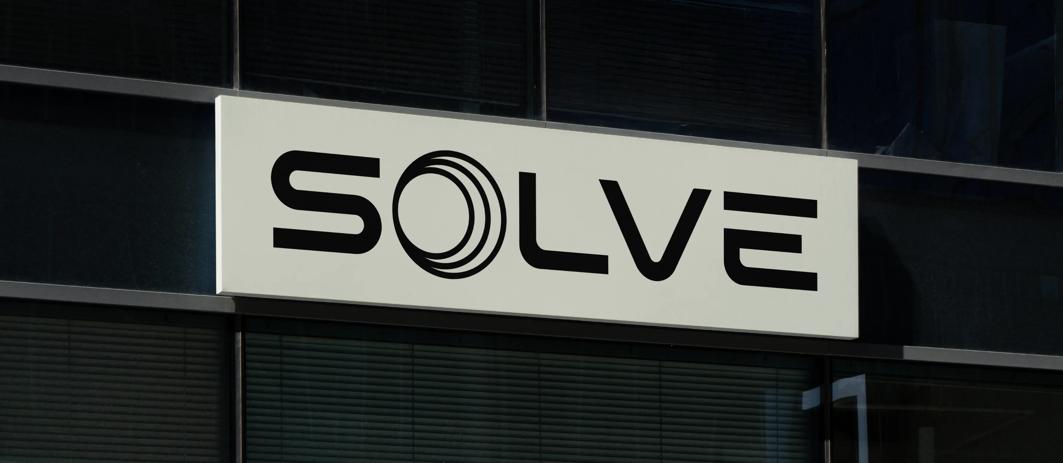
Solve Energy | Retro Futurism
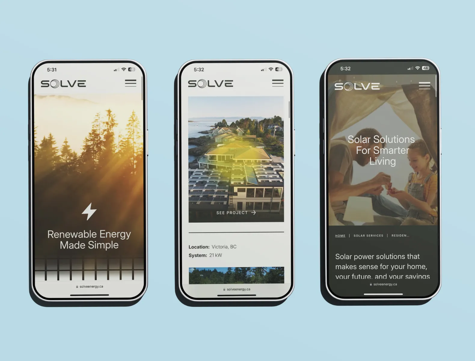
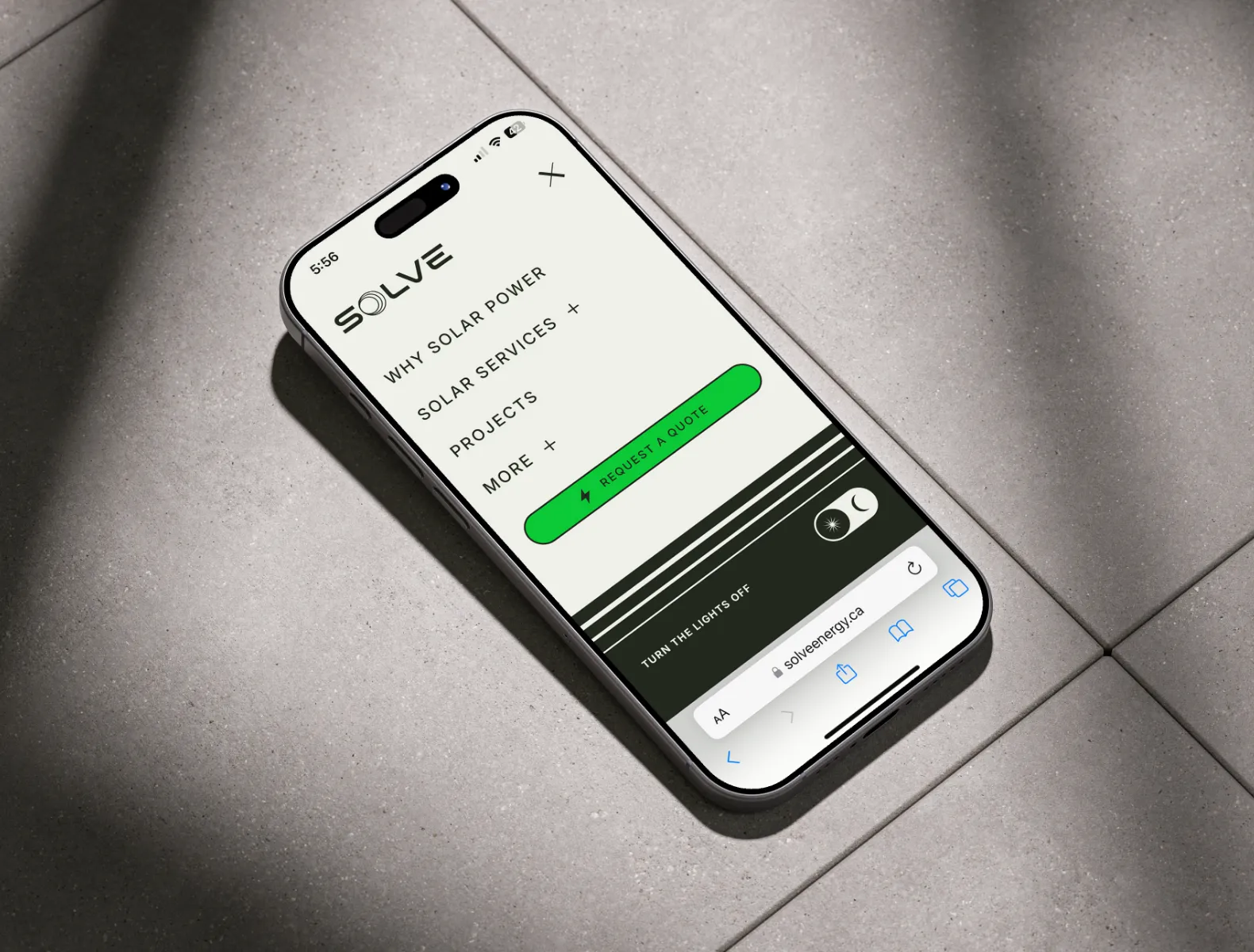
Solve Energy is a B.C.-based solar energy company on a mission to make clean, affordable energy accessible to everyone. They had an existing identity and website, but they were looking to expand across Western Canada and needed help with a rebrand and an updated website to reflect it.
The Problem
Solve's identity needed to grow with them. They had a strong foundation to evolve into the future of their company. The problem was that it wasn't setting them apart from their competitors. How could their brand and online presence set them apart as a trusted expert in their field?
Credits
Agency
Array
My Role
Art Direction
Lead Designer Brand & Web
The Team
Kristina Crowson, Sarah Brown, Jason Schultz, Alejandra Silva Rojas, Myra Dionne, Paarth Dhammi, Aaron Paetkeau
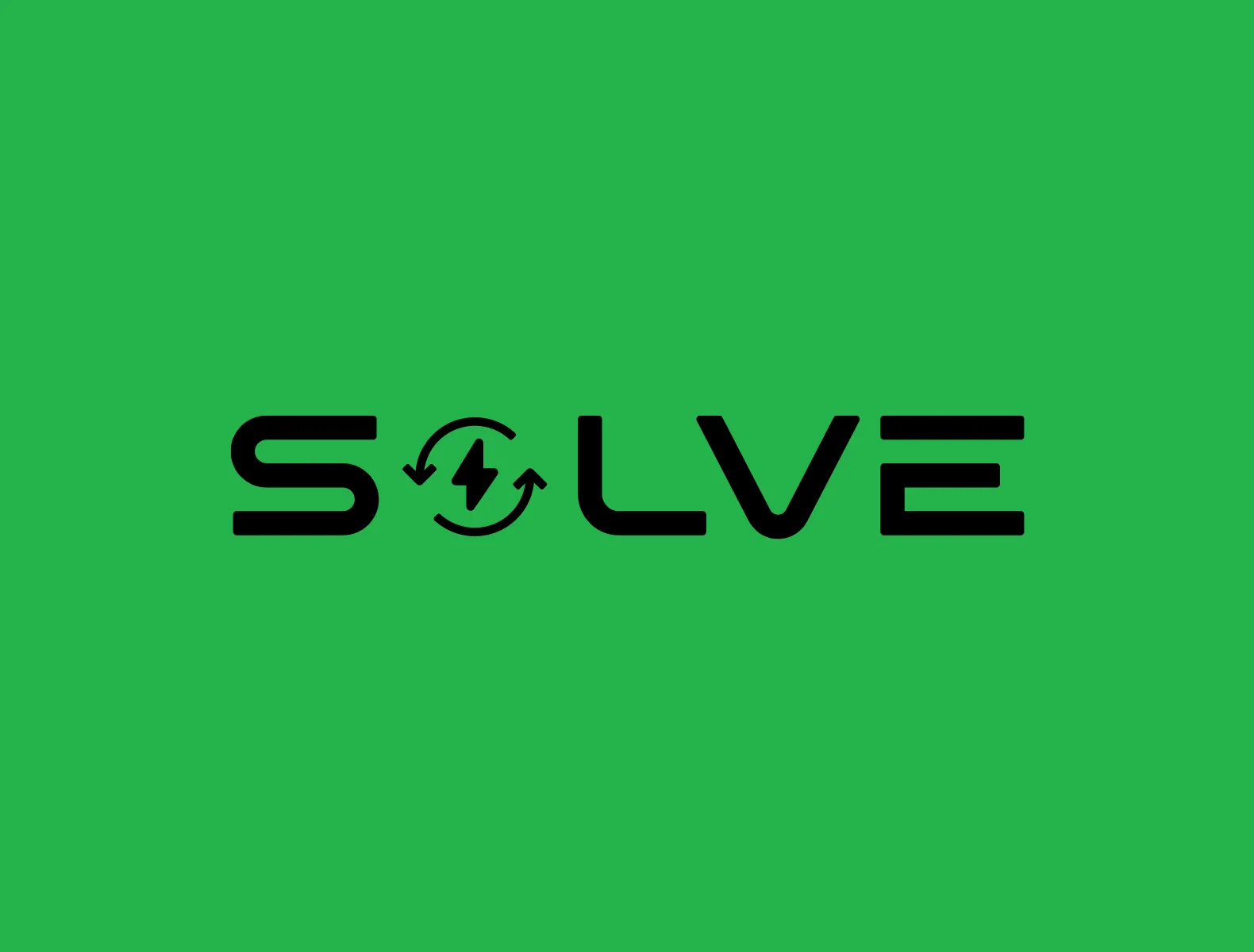
Before
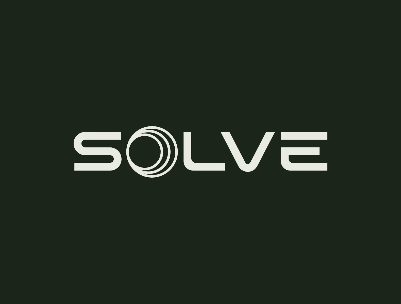
After

The Concept
Retro Futurism
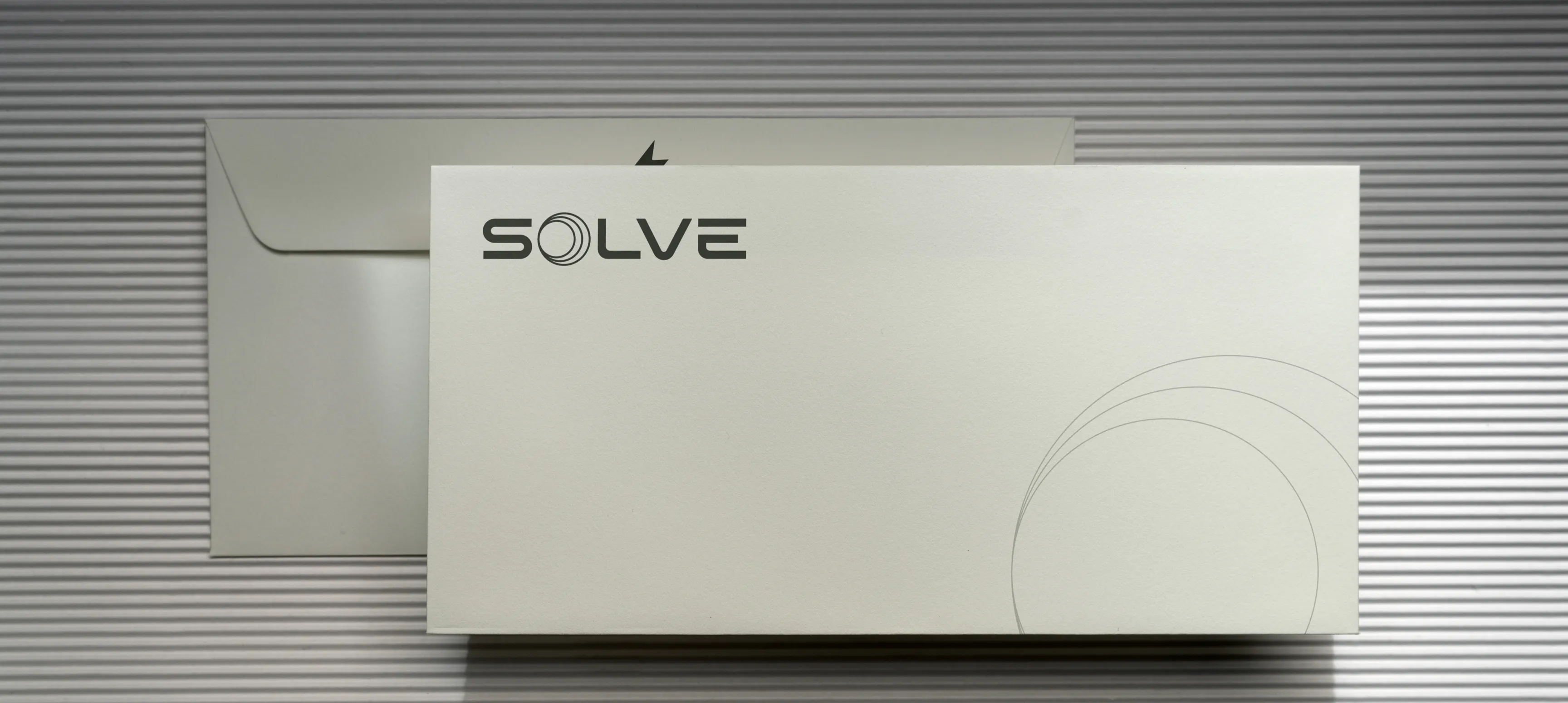
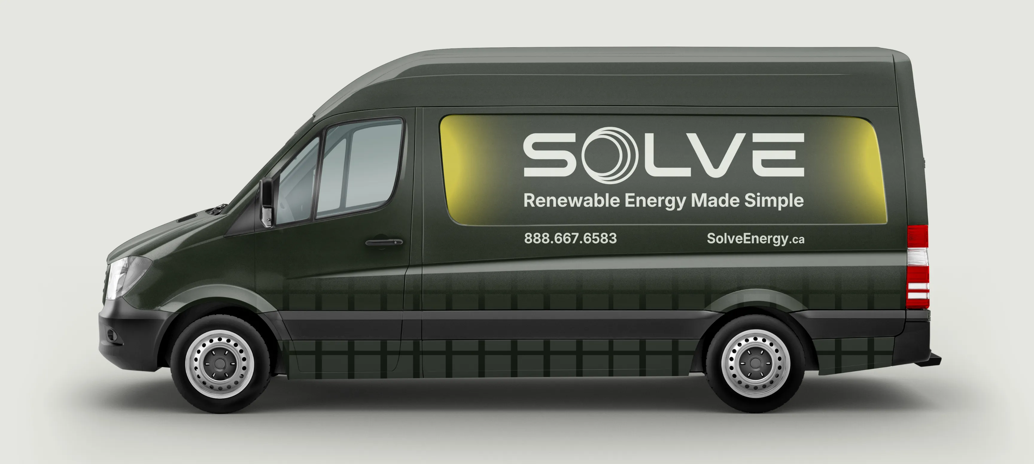
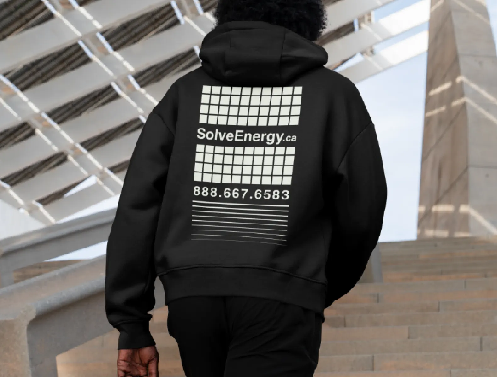
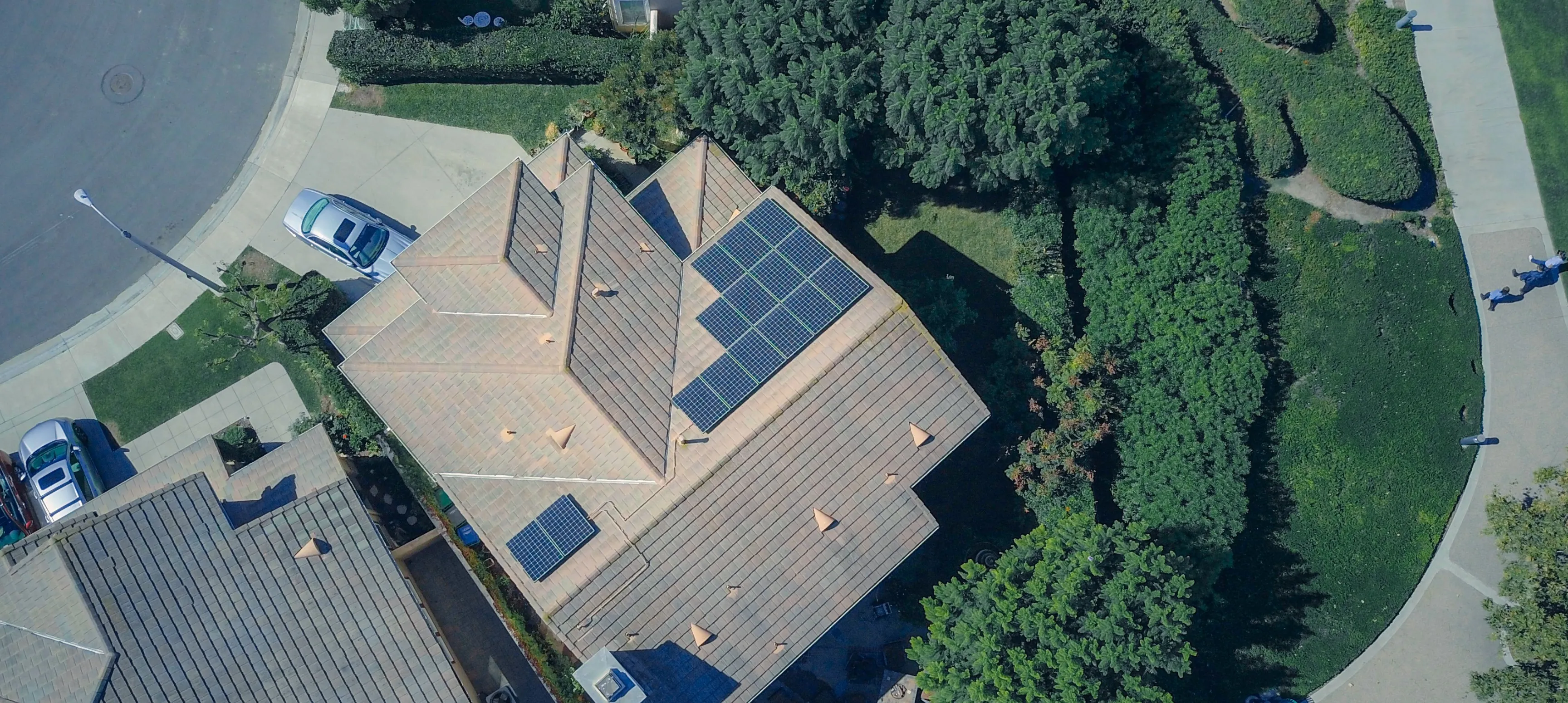
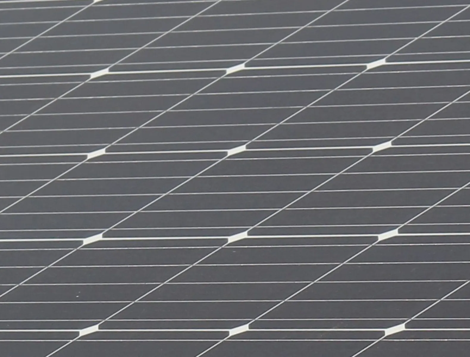
How could Solve's offering of renewable solar energy be distilled down to its cleanest, simplest form? The inspiration for the identity came from “retro futurism.” Their original logo typography reminded me of NASA. How could we push that further? After looking at the original NASA brand guidelines (they are BEAUTIFUL), it inspired the cascading line treatments. The brand really took off from there. We paired the retro-futuristic graphics with warm, modern photography showcasing life energised by solar.
The Solution
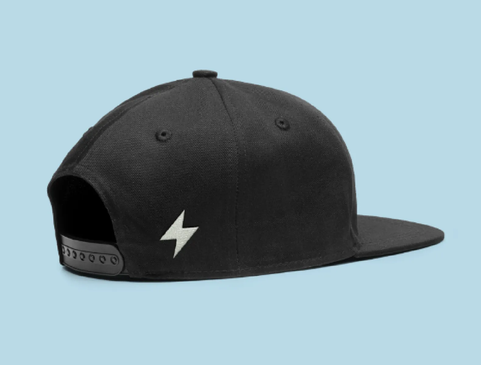
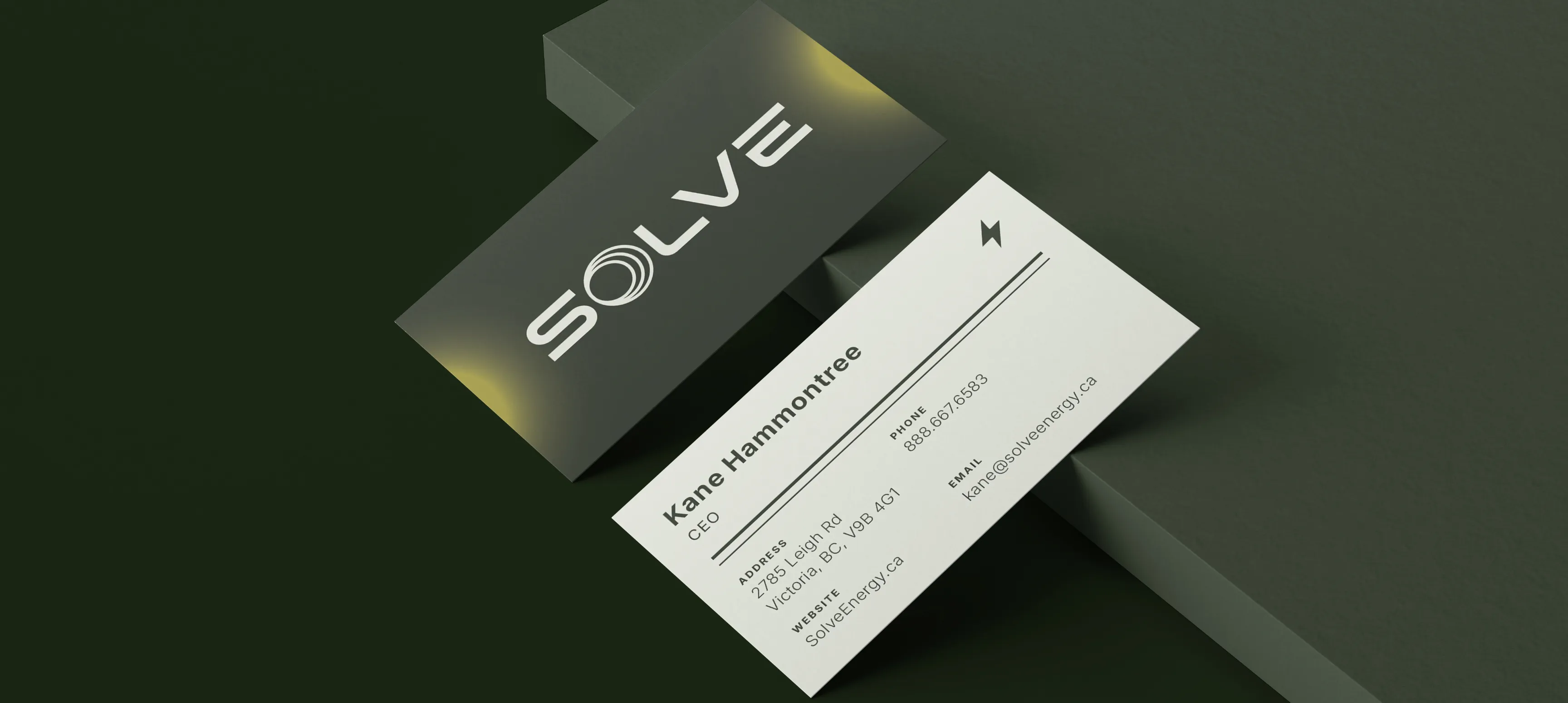
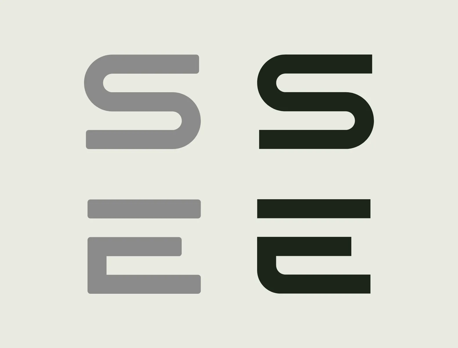
Through a collaborative process, I worked alongside Creative Director Jason Schultz to develop the brand identity for Solve Energy. We worked together on different elements of the design, from customising their existing typeface to redesigning their icon to creating a set of graphic elements cuing concepts of glowing solar energy, gridded panels, and retro line details. All of these elements were set in motion to create a robust brand identity system.