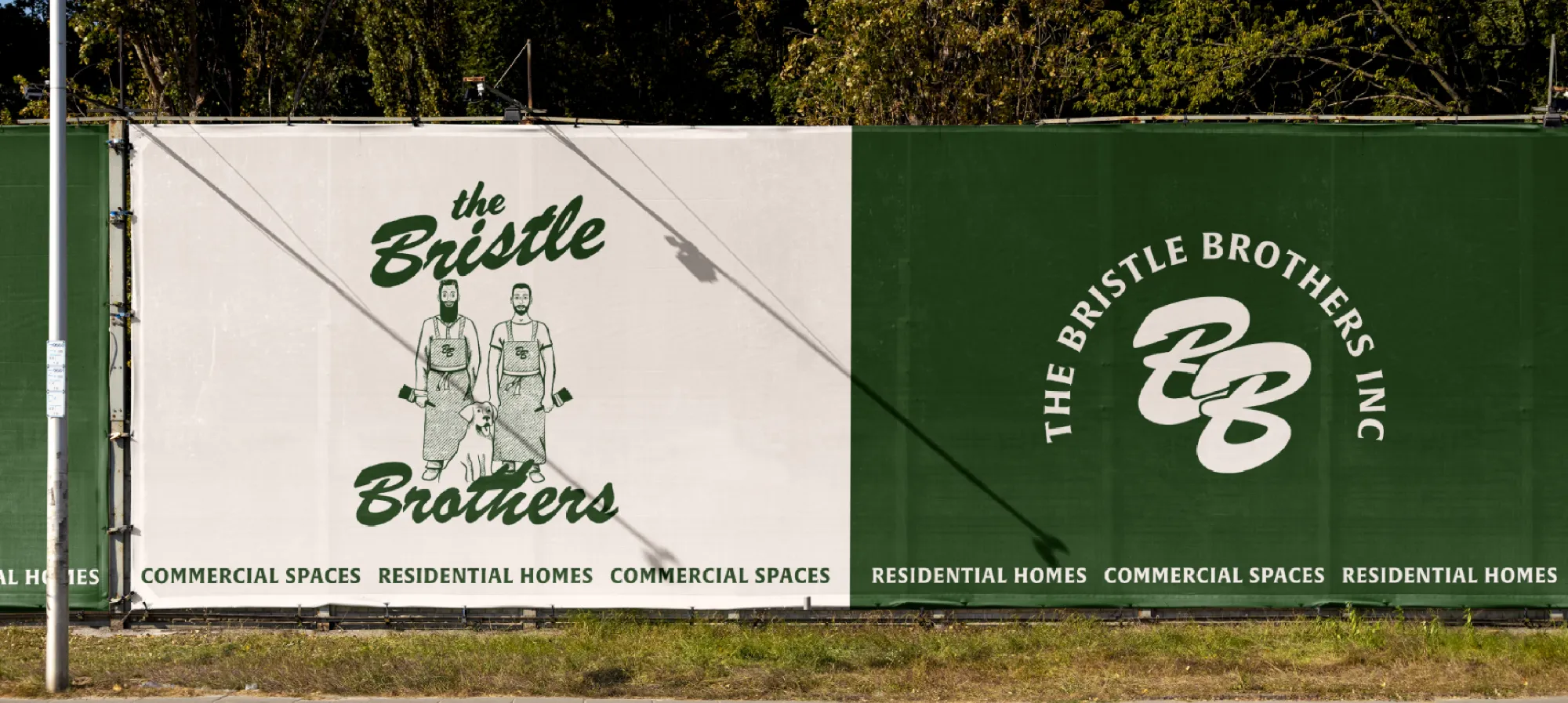
The Bristle Brothers | Throw It Back
The Bristle Brothers are a brother painting duo. In 2021 they decided to open their own business after working for other companies since '97. They approached me to design their brand identity with a 50s retro feel.
The Problem
The main goals for the brand identity were to communicate experience through retro design, make them feel like an established business with (combined) 40 years of experience, and to build trust with their target audience of both homeowners and local business owners.
Credits
Agency
Emily Kiana Design
My Role
Brand Identity Design
Strategy
Graphic Design
Badge
Monogram
The Concept
Throw It Back
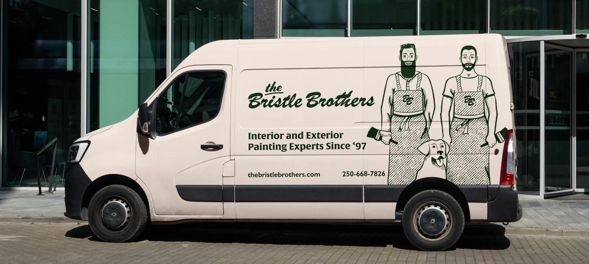
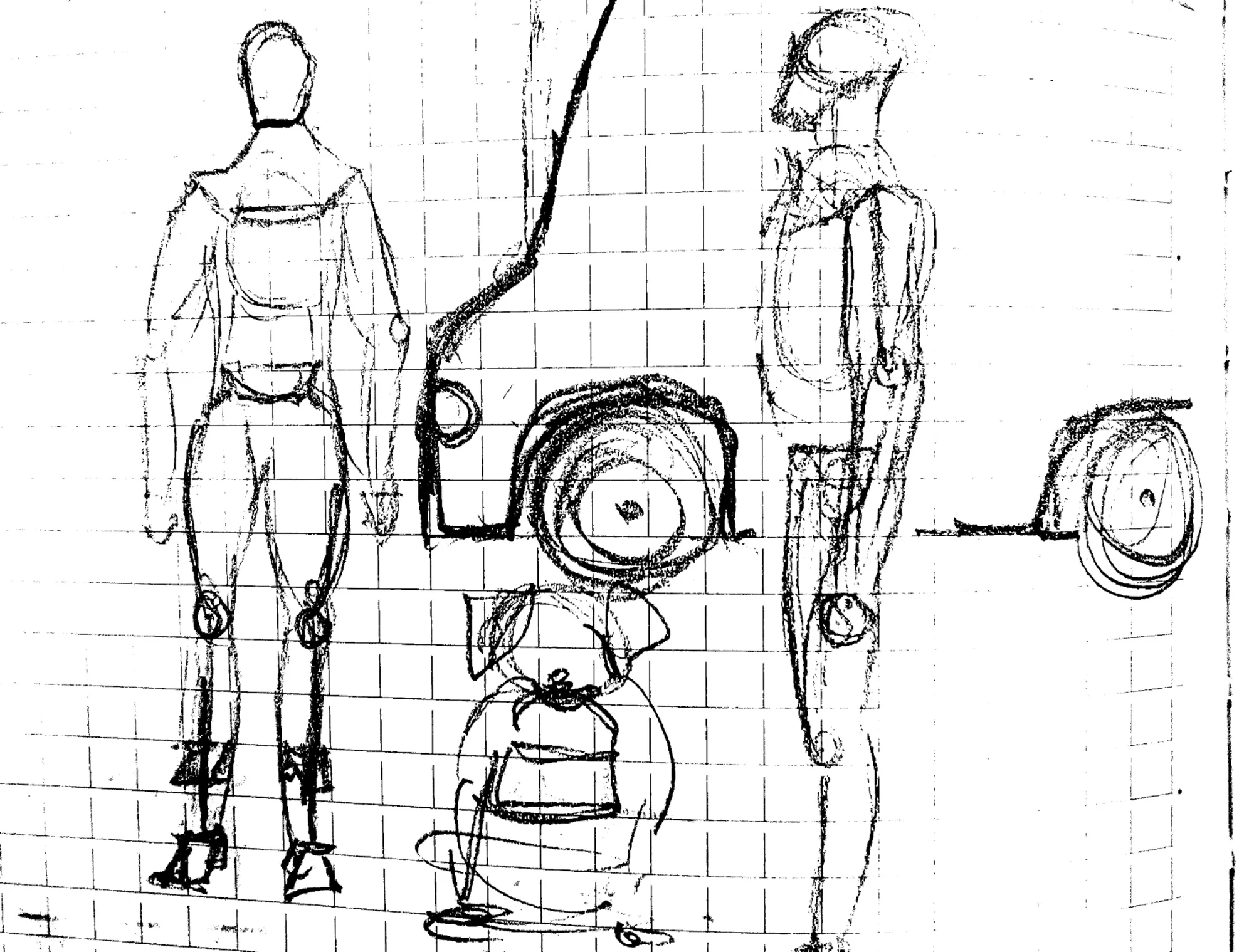
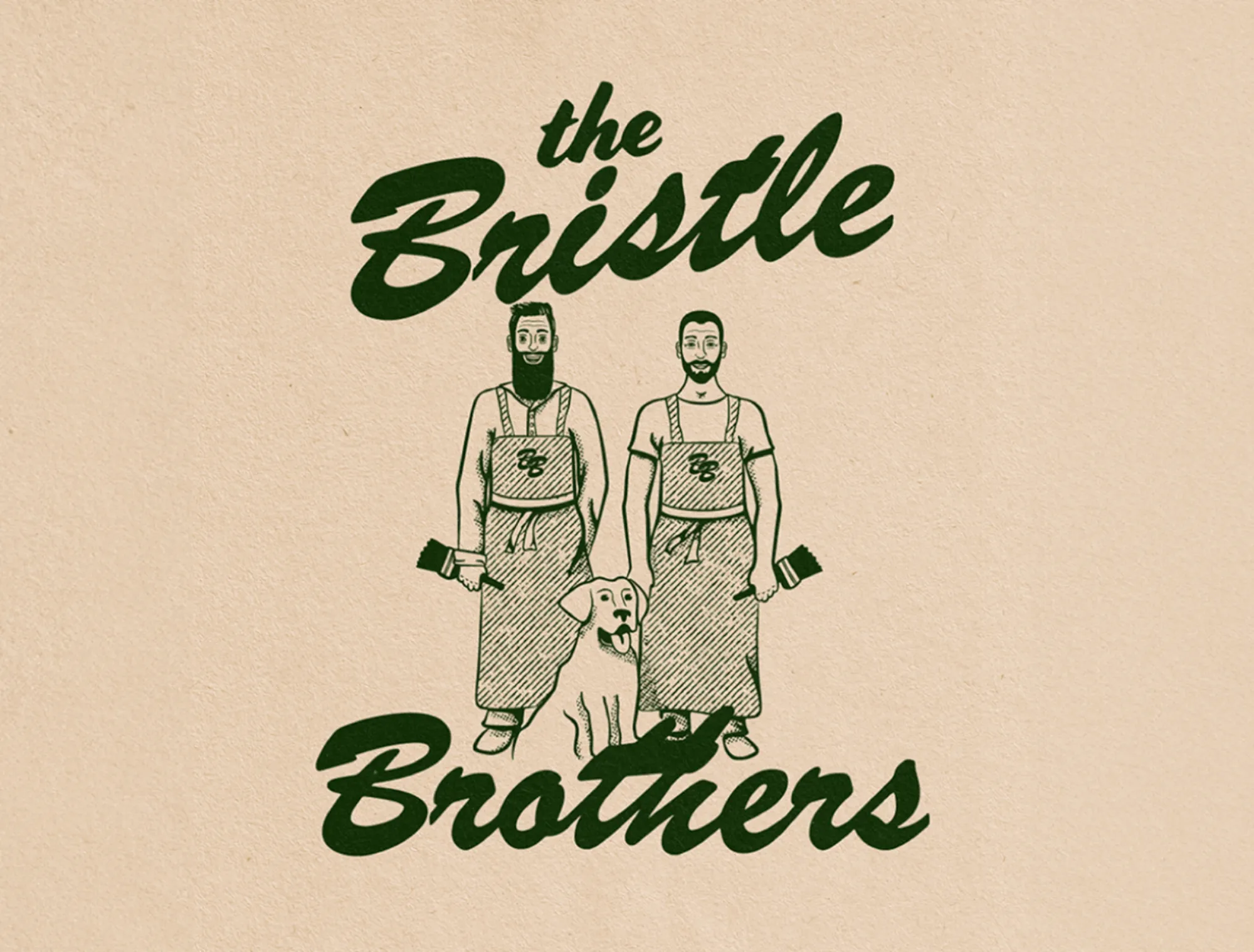
Chris came to me with the idea of going for a retro illustrated logo concept showcasing him and his brother Nick with Chris’s dog, Charlie. We aimed to design a retro-inspired brand system that communicated experience and dependability.
The Solution
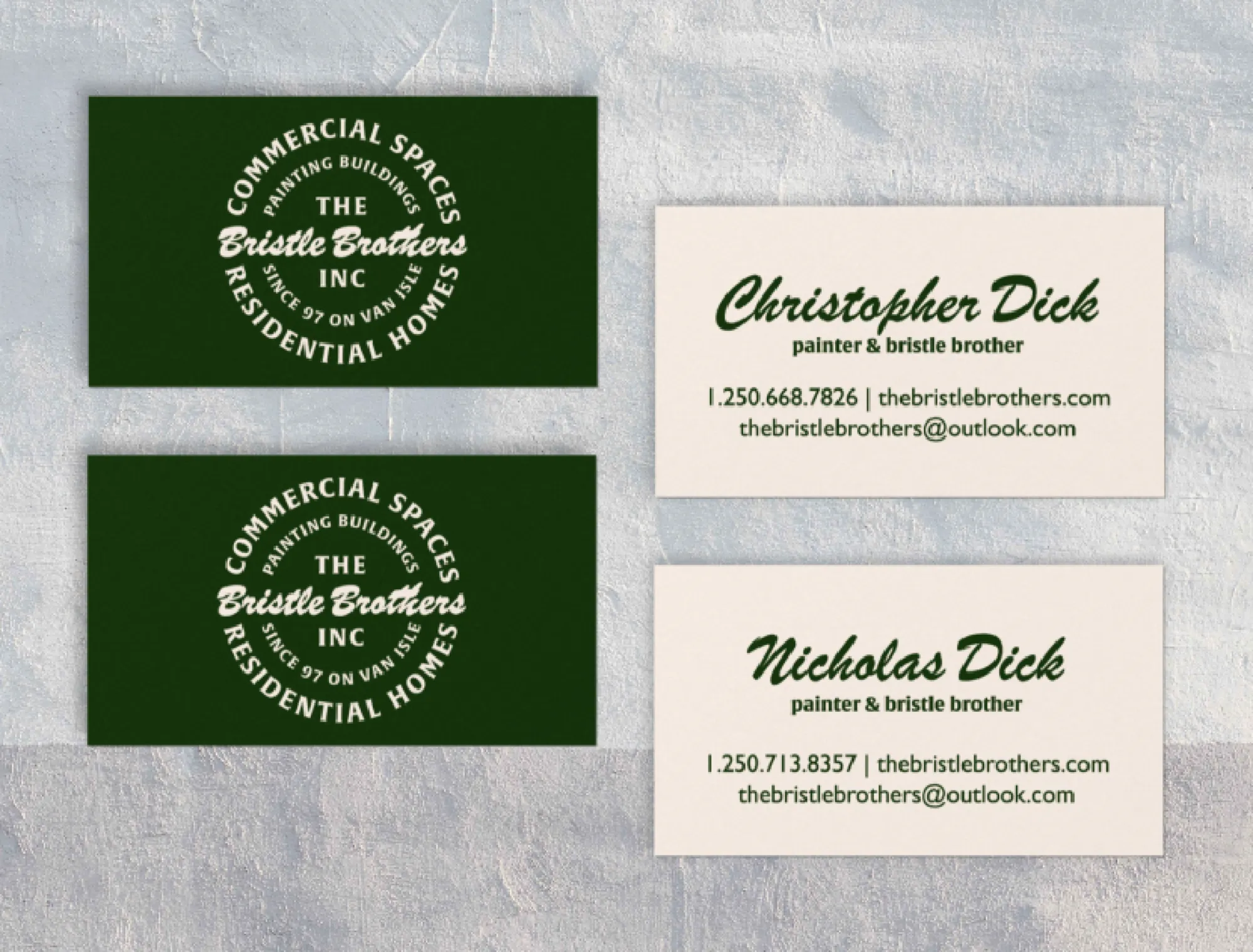
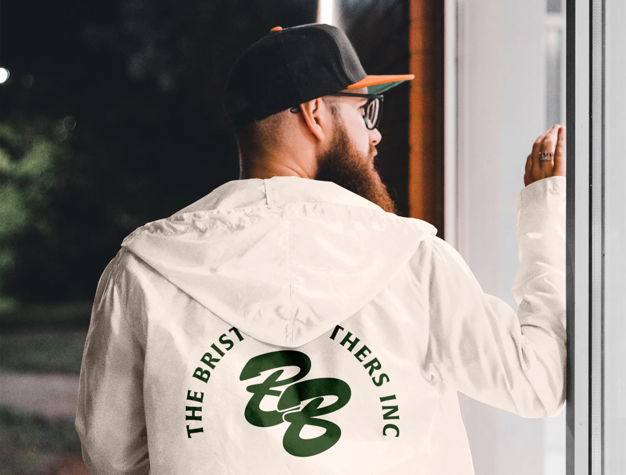
The system would need to be applied across multiple contexts, such as van decals, T-shirts, business cards, hats, the web, and more. Although I love the maximalist style of the illustrated logo, I knew The Bristle Brothers would need stripped-back versions that could be scaled down and used in multiple contexts. For this reason, I designed a full logo system for them that could be applied to various contexts seamlessly. Although each mark is different, they have strong continuity from one to the next.