The Salty Woodsman | Stay Salty
Nile & Nadine’s shop was previously NV Seafood. They came to Clever Jane and Majorette to help them rebrand to showcase a larger offering. Located in Port Alberni on Vancouver Island, they wanted their shop to be a destination for locals and travellers alike passing through on the way to the West Coast. They were no longer just selling seafood; they had home goods, gifts, and pantry items.
The Problem
The number one goal was to grow awareness of The Salty Woodsman as a company, but also of their expanding offering. First and foremost, we needed to make it very clear who they were, what they sold and where they were located. Then bring it to vibrant life with a brand identity that was fun, quirky and a little bit wild.
Credits
Agency
Clever Jane
My Role
Lead Designer Brand
Brand Illustrations
The Team
Design & Development: Liz Parsons, Emily Kiana, Barry Begus
Naming & Messaging: Marget Milne, Elizabeth Hewitt
Photography: Danika Sea
Wordmark

Monogram
The Concept
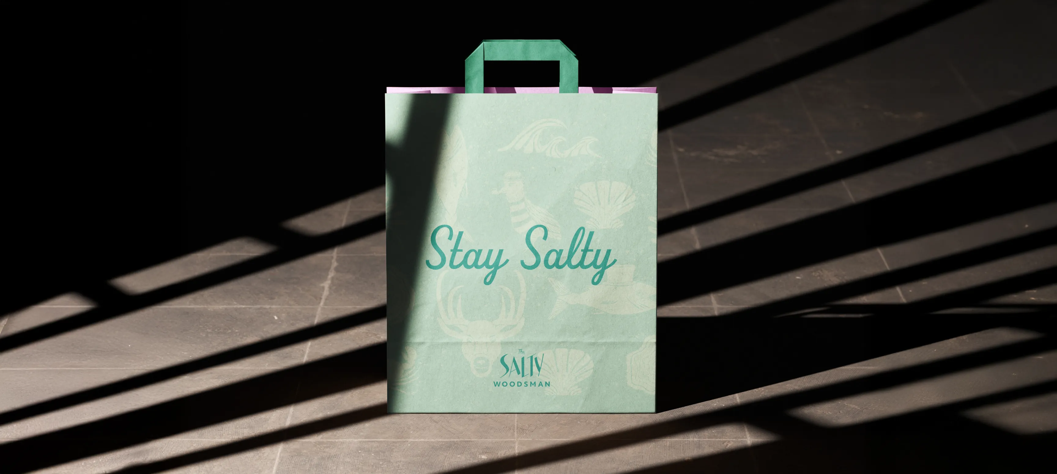
Stay Salty
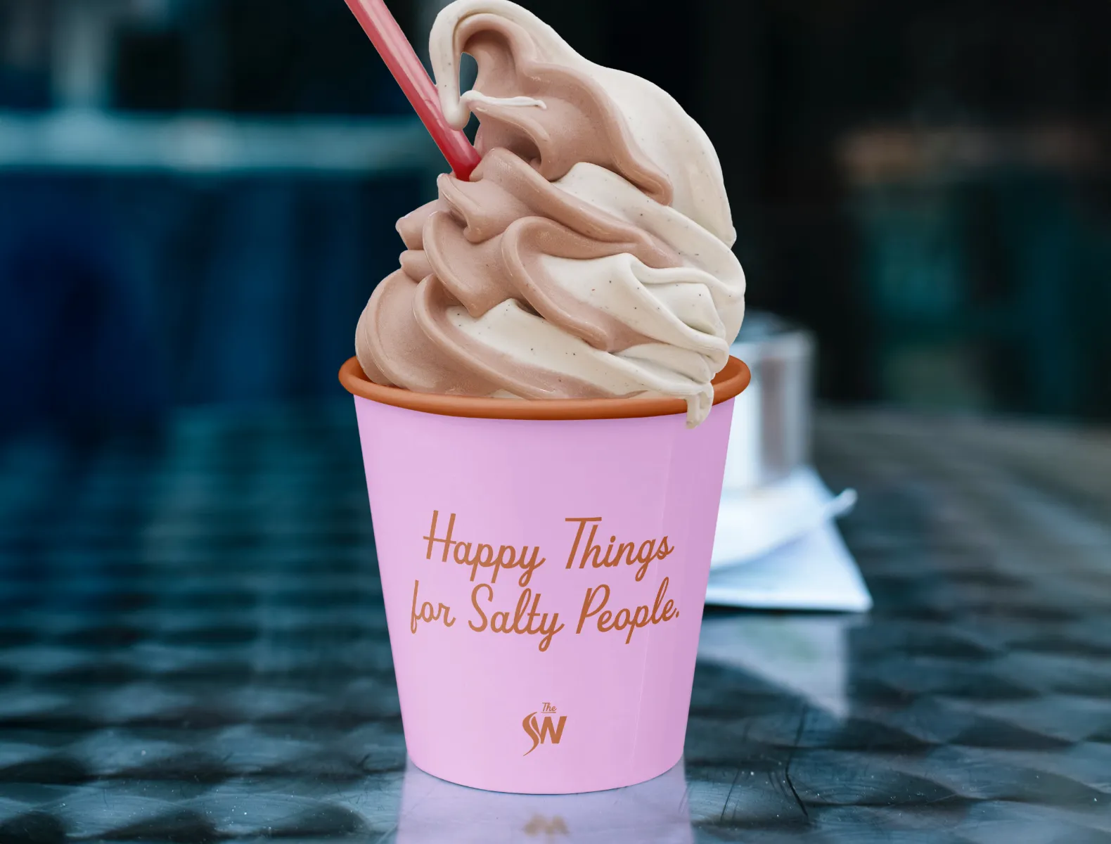
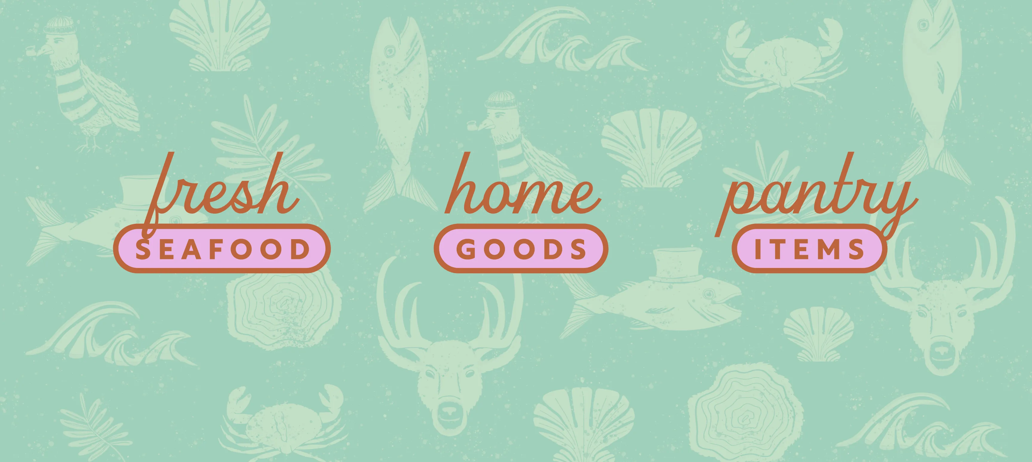
With a name and tagline written by Majorette, the concept became very clear. Every aspect of the brand needed to be a little bit salty. How could we show saltiness in a variety of ways? Illustrations covered in salt inspired by watercolour salt effects, a slightly "salty" attitude to the characters, more-is-more typography, and clashing colours.

The Solution
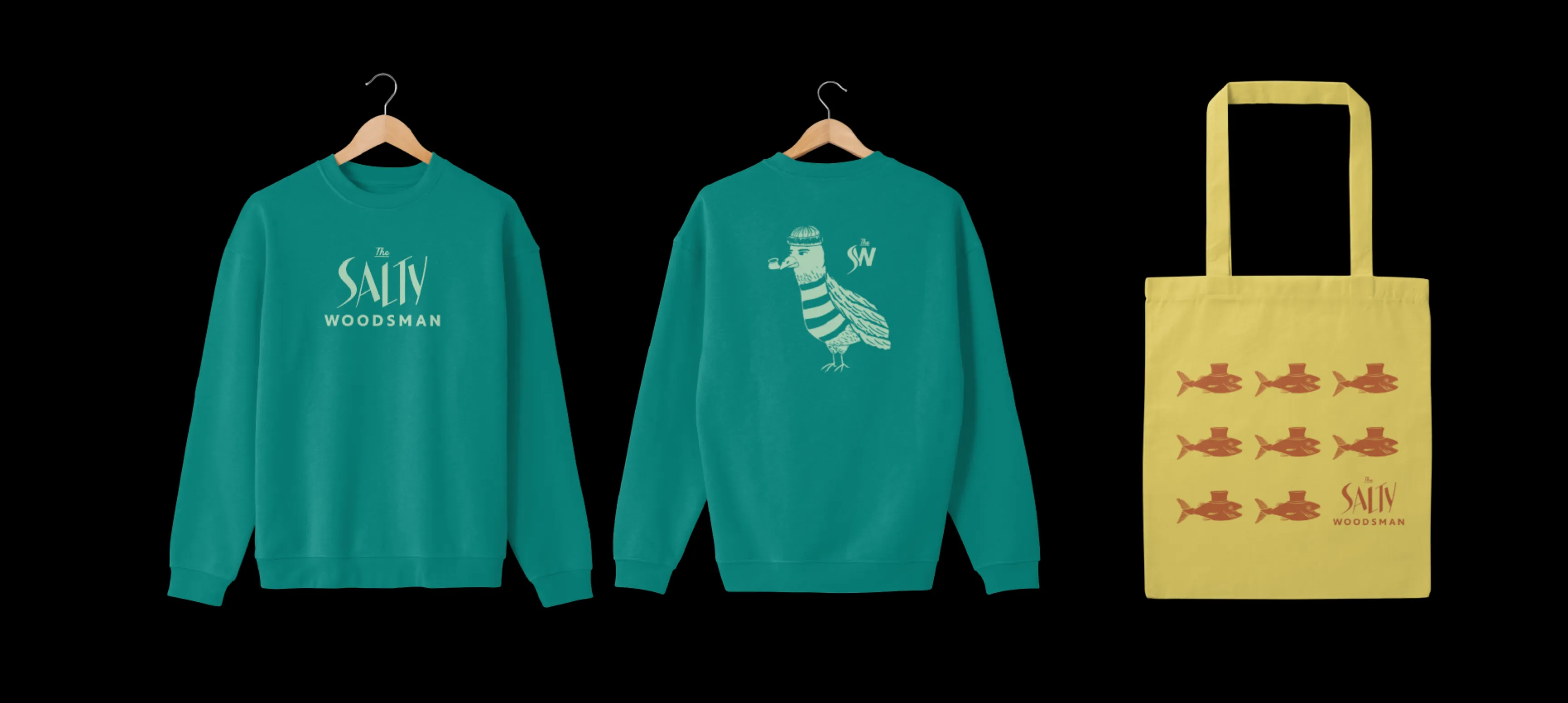
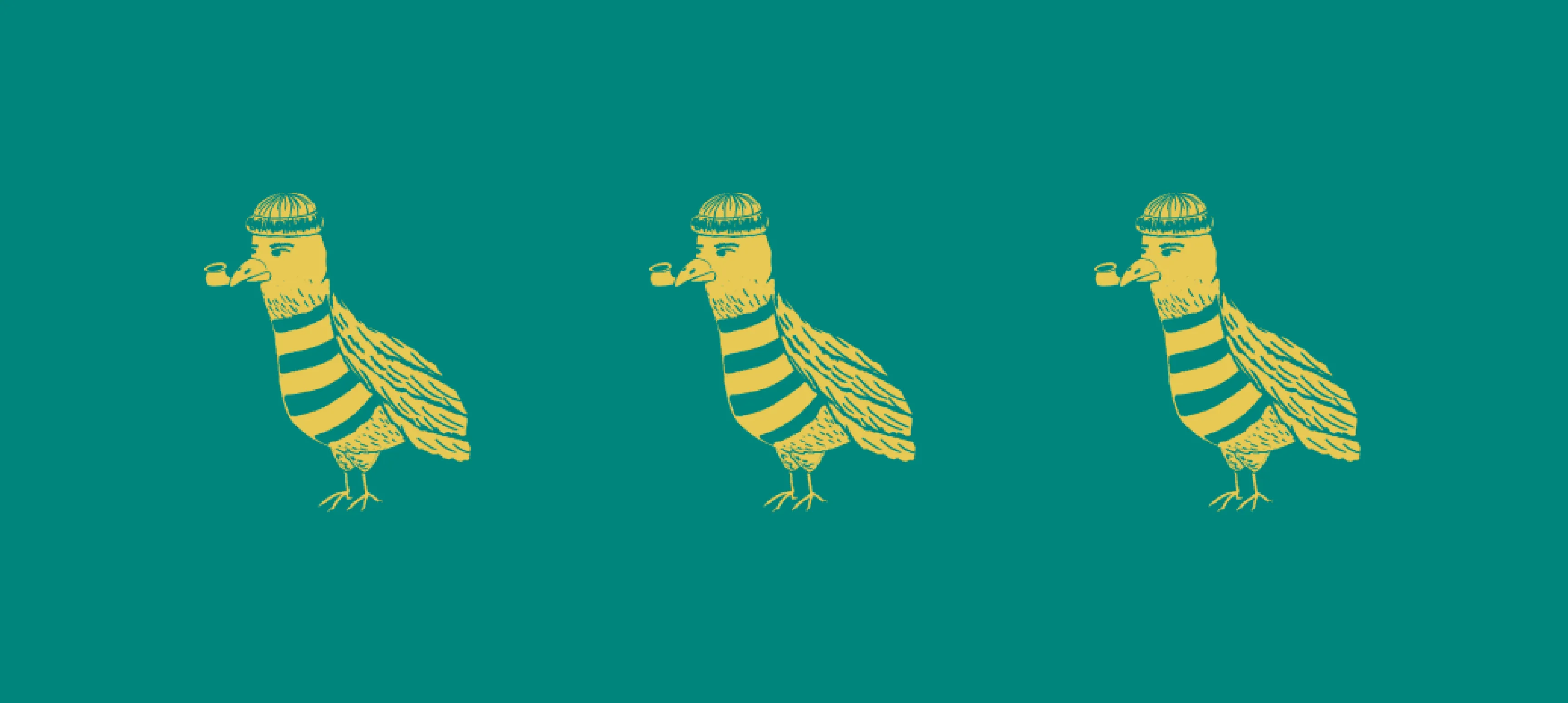
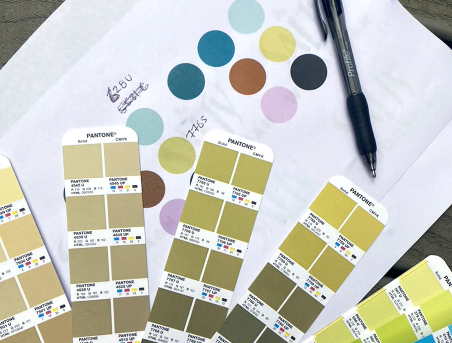
Inspired by lake houses, palm springs motels, and gloriously tacky wallpapers, the Salty brand came to life with typography influenced by the jagged fish bones, and one-of-a-kind illustrations (picture pipe smoking seagulls and fish in top hats). With each illustration we highlighted the variety of products they sell, while injecting a major hit of personality. Slightly off-beat, the illustrations, combined with loud clashing colours created a brand identity that is tongue-in-cheek and completely irresistible.